UI/UX Design
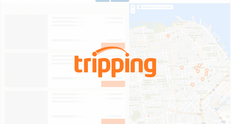
Tripping - Journey Through Stories
At Tripping, I led a full-site redesign with a mobile-first approach, focusing on responsive UX across devices. I worked on integrating personalized search using machine learning, helping users surface more relevant travel listings. Through user testing and iterative design, we refined core flows and removed friction—making the platform feel more intuitive, faster, and tailored to the traveler.
Full Case Study
🎯 The Challenge: Turning Clutter Into Confidence
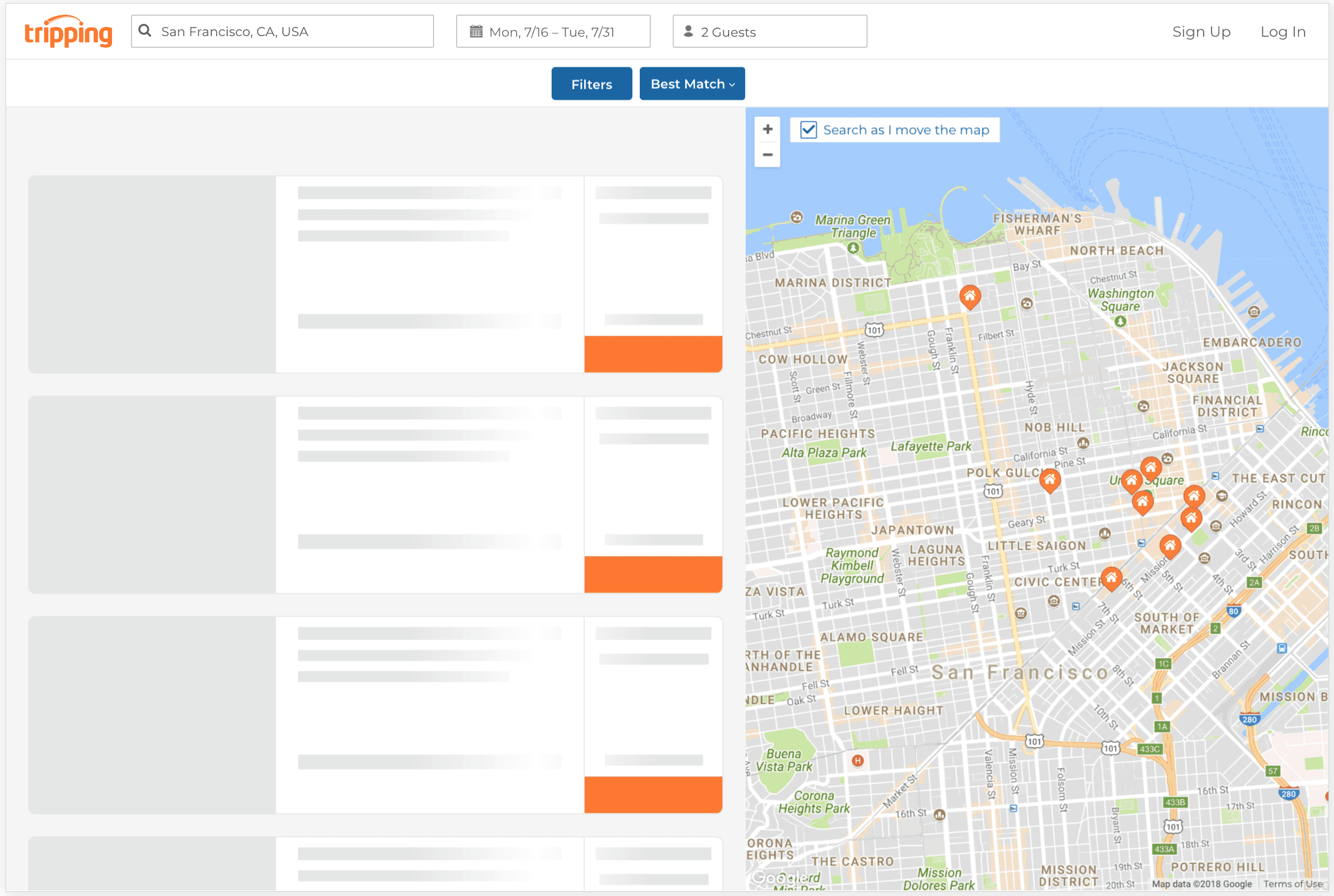
In the vacation rental space, users are making high-consideration decisions—often under time pressure. But Tripping.com’s search experience wasn’t meeting those expectations.
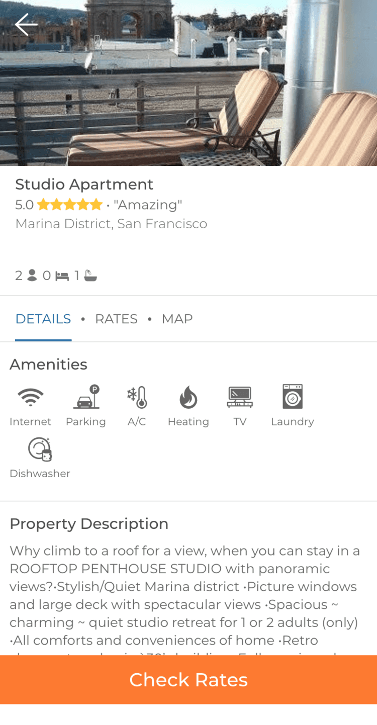
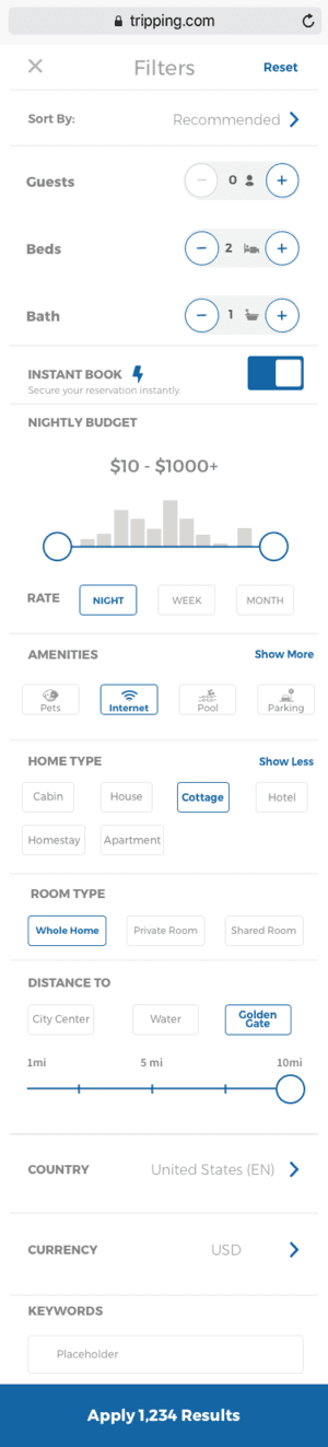
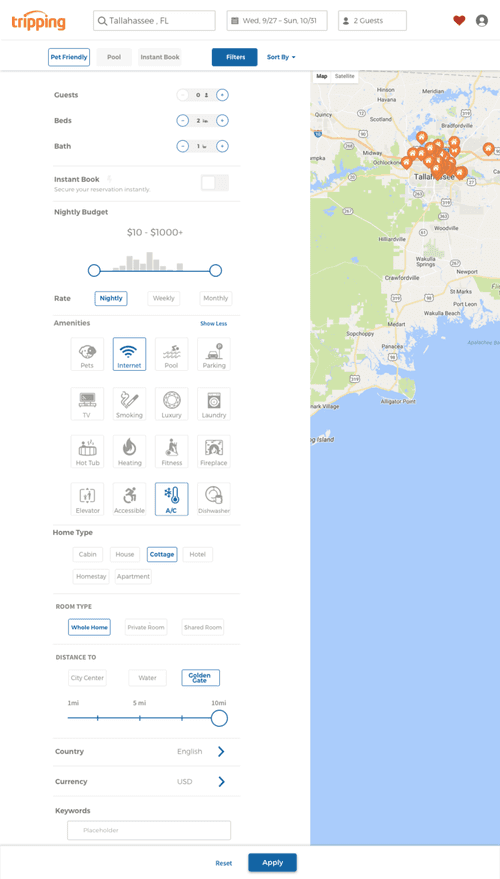
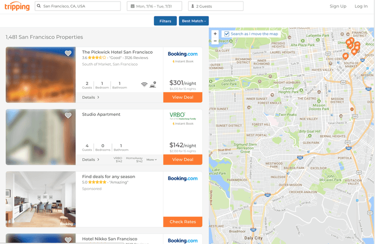
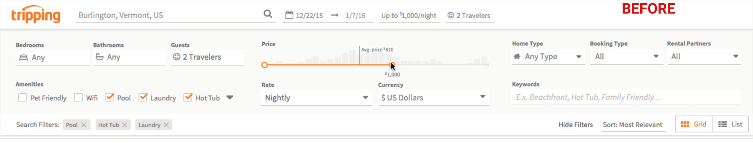
The filters were too small and hard to use, especially on mobile. The visual layout was cluttered, and user-uploaded listing photos weren’t always helpful. Instead of cozy interiors, users were often greeted by photos of toilets, kitchens, or blurry corners—making the site feel unreliable.
It wasn’t just a UI issue. Poor image quality and unclear filters were contributing to low engagement, high bounce rates, and decision fatigue.
To stay competitive with platforms like Airbnb, Booking.com, and Vrbo, we needed to deliver a search experience that was not only functional, but felt trustworthy, visual, and intuitive from the first glance.
🔎 Research & Discovery
To understand what was driving bounce—and what users expected—we partnered closely with product, engineering, and support to gather both qualitative and quantitative insight.
Research Methods:
User Feedback Review – Analyzed complaints about image quality, filter usability, and comparison friction
Funnel Drop-Off Analysis – Mapped the booking flow to identify where users lost momentum
Competitive Benchmarking – Studied Airbnb, Booking.com, Vrbo, and others to assess best practices for visuals, filtering, and layout clarity
Key Insights:
Users judged listings based on the first photo—and bad visuals killed interest immediately
Filter interactions felt clunky and confusing, especially on small screens
Too many competing CTAs and irrelevant photos created a low-trust experience
People couldn’t easily compare listings without bouncing between tabs or backtracking in the UI
“Why is the first image a bathroom? It makes me not even want to click.” — User Feedback, Support Ticket
🧭 Design Goals
Our approach centered around three strategic UX objectives:
Boost Trust with Better Visuals: Prioritize listings with high-quality, relevant images
Simplify Filtering & Comparison: Make it easier to narrow down results and spot key differences quickly
Declutter the Interface: Guide users clearly without visual overload or decision fatigue
💡 Design Strategy
With a small team and limited development resources, we focused on improvements with high user impact and cross-platform scalability.
Key UX Decisions:
🧠 Image Intelligence with ML
We partnered with engineering to implement a machine learning model that scanned and scored user-uploaded listing photos. It prioritized clean, well-lit, and room-centric images—elevating listings with inviting visuals and demoting those with irrelevant or low-quality thumbnails.
Automatically selected the most appealing image as the primary display
Surfaced fallback logic when image confidence scores were low
Resulted in more relevant, higher-performing visuals across the site
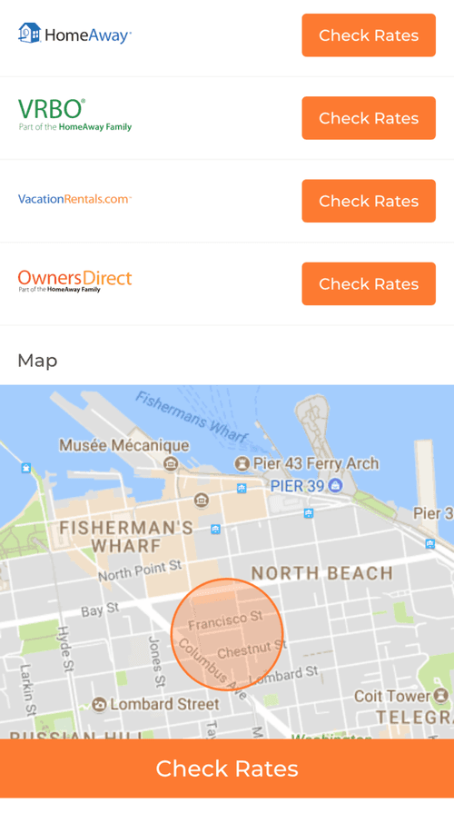
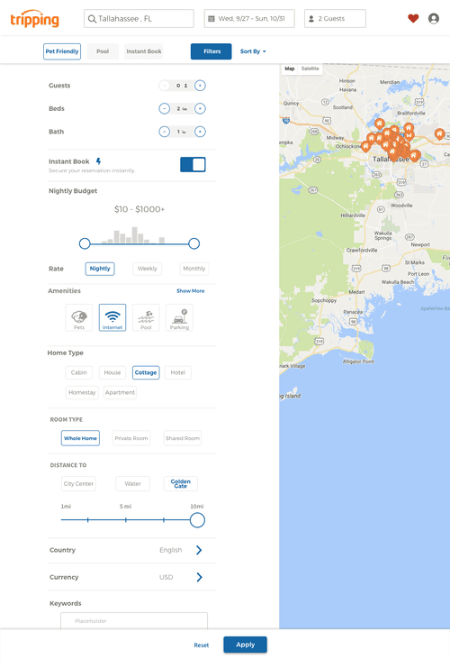
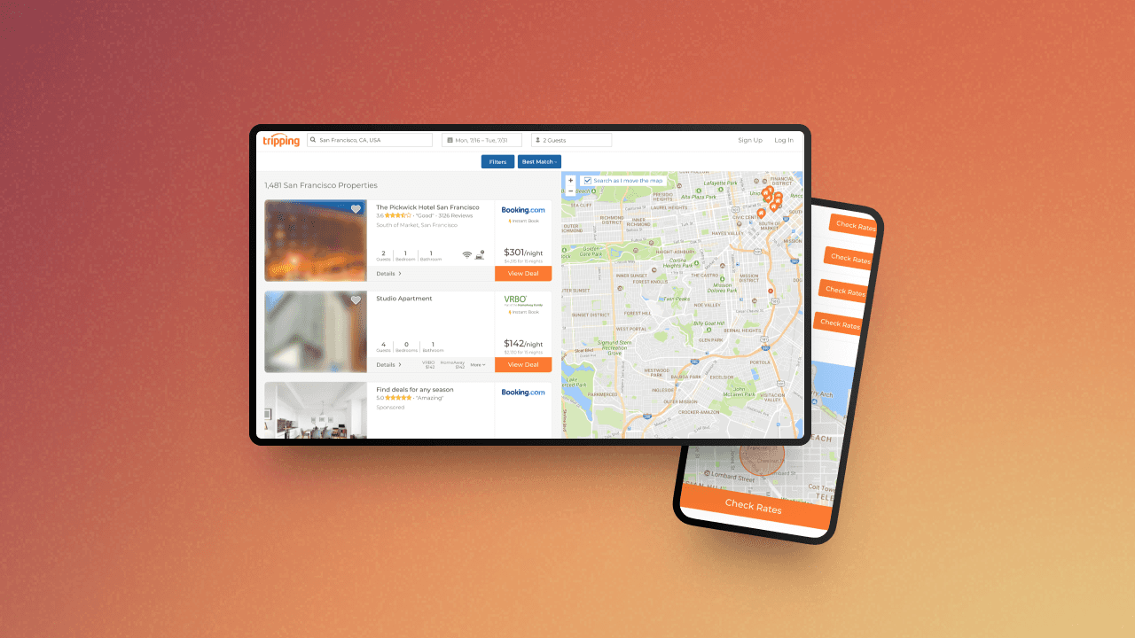
🔍 Filter & IA Redesign
We overhauled the filtering experience to be faster, more intuitive, and easier to access:
Introduced a sticky filter bar on desktop and mobile
Grouped filters into expandable categories (e.g., price, location, amenities)
Enabled quick edits without reloading the page
Added “smart suggestions” based on trends, like Last-Minute Deals or Pet-Friendly
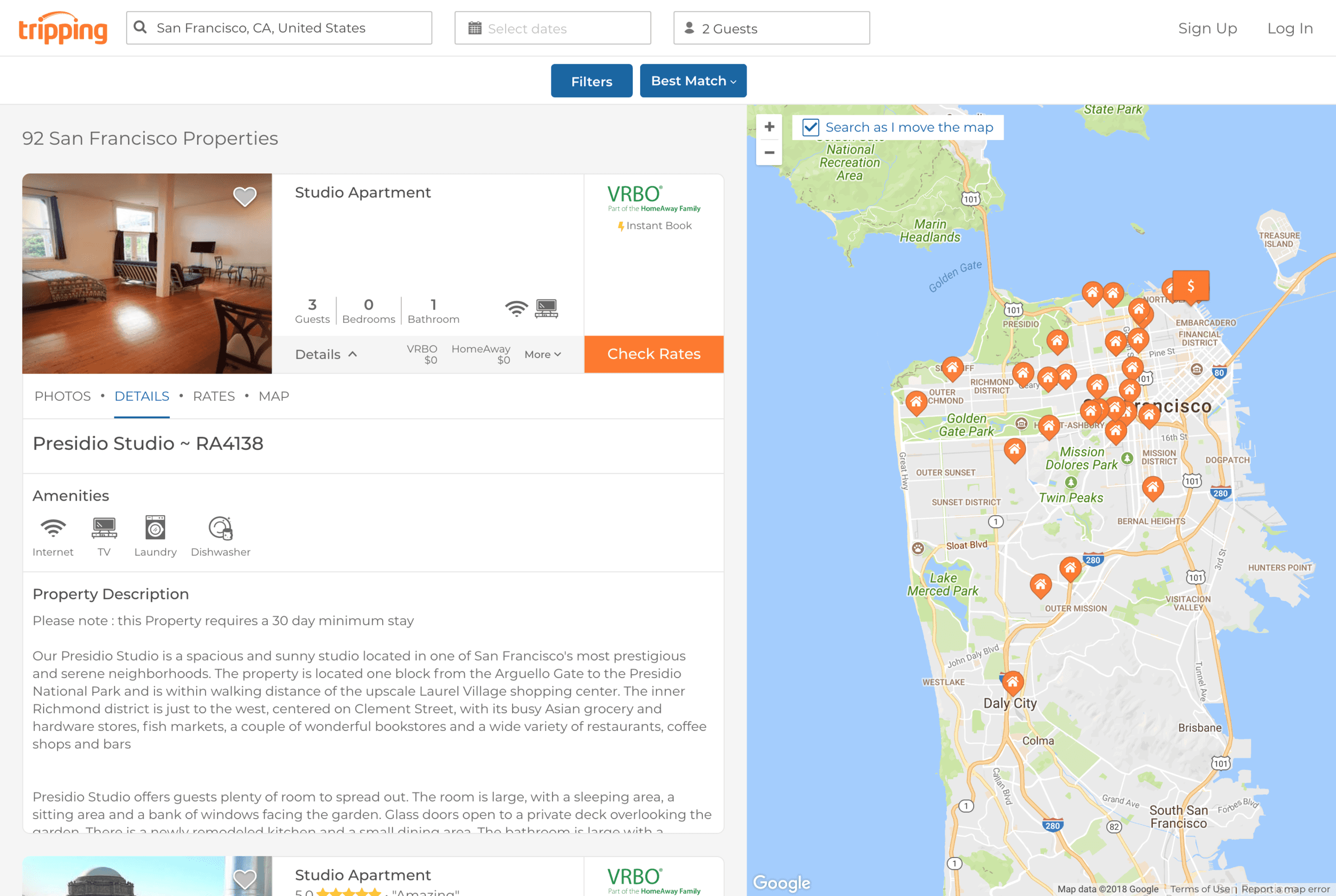
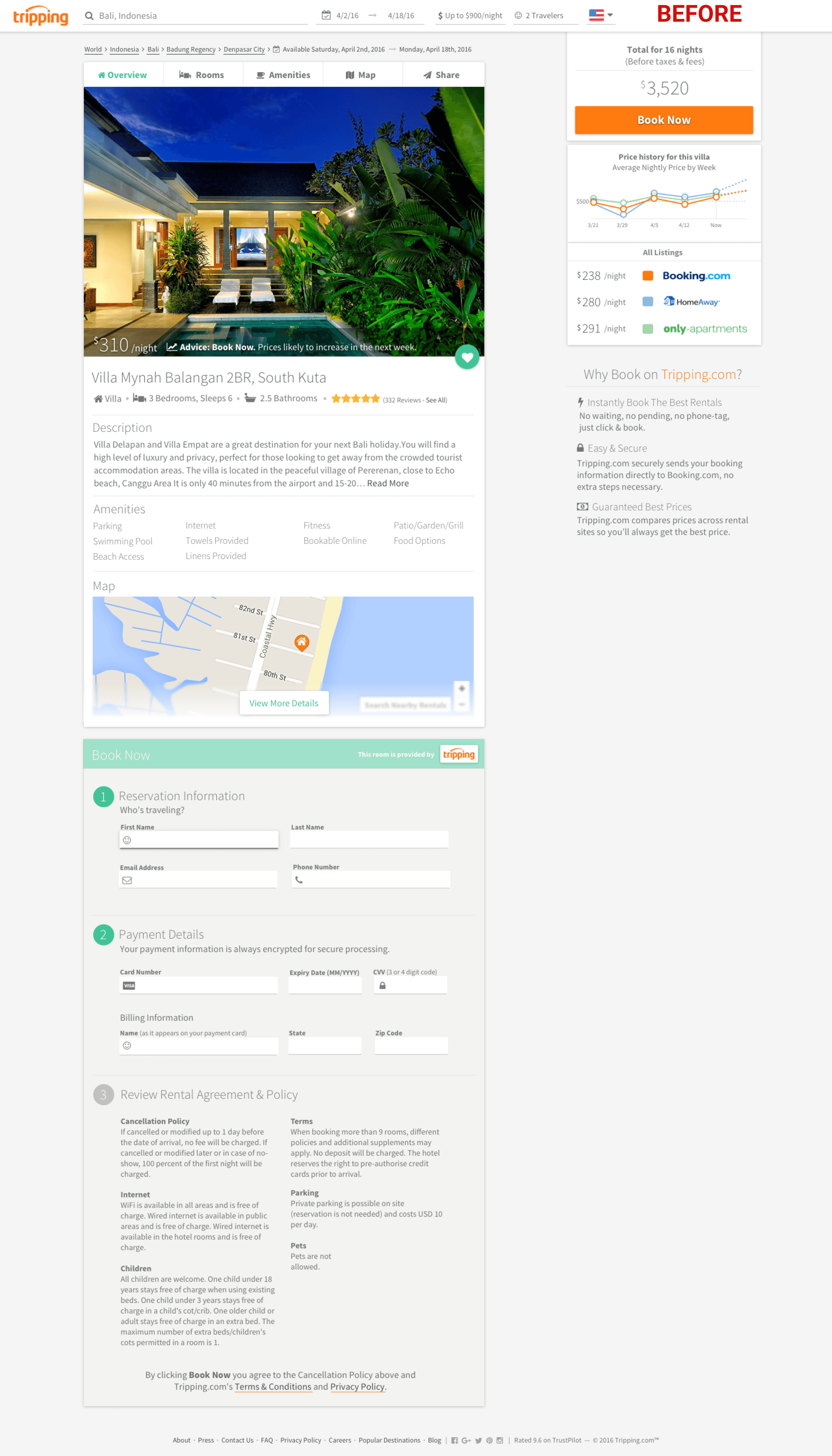
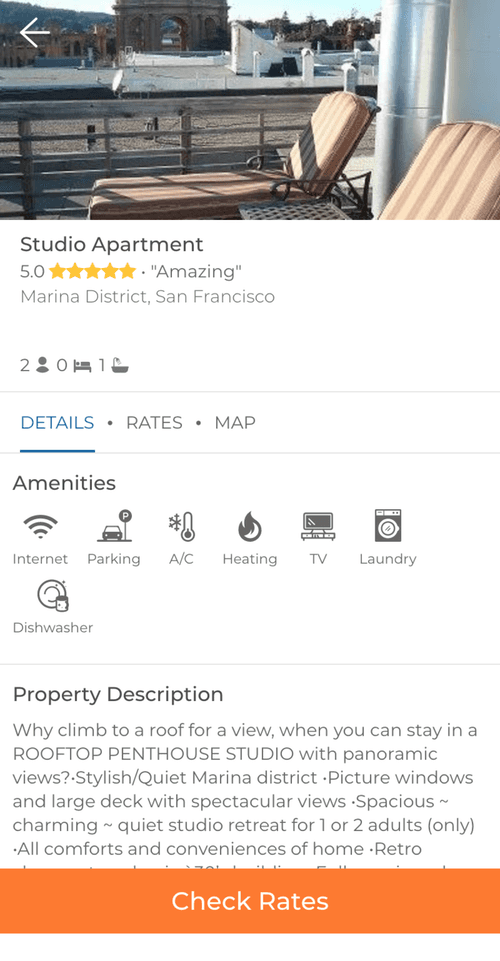
🧳 Visual Card Layouts
We redesigned listing cards to better support scanning and side-by-side comparison:
Large image previews with hover states to reveal key details
Clear visual hierarchy: price, rating, amenities, location
Transparent pricing: showed both total cost and per-night breakdown
🧪 Prototyping & Testing
I created interactive, responsive prototypes in Figma covering the full booking flow:
Homepage → Search Results → Listing View
Usability Testing Focus:
Tasks: Filter for a location, compare 2–3 listings, choose one to book
Metrics: Confidence scores, time-to-click, comprehension of pricing
Feedback Themes: Visual quality, filter speed, trust, comparison ease
Key Learnings:
Users called the new layout “cleaner” and “easier to trust”
Image upgrades significantly improved first impressions
Sticky filters and grouped options kept users in flow
Listing card changes made side-by-side decision-making faster and more confident
“I didn’t even realize how bad the old version was until I used this one.” — User Test Participant
✅ Final Design Solution
🔧 Core UX Features:
ML-Powered Image Selection: Automatically ranked and prioritized top visuals
Sticky Filter UI: Persistent, expandable filter interface with smarter defaults
Refined Listing Cards: Visually clean layout with hover previews and key info up front
Responsive Design: Mobile-friendly navigation, layout, and filtering
🎨 Visual Enhancements:
Simplified typography and content blocks for focus
Whitespace and grouping to reduce noise
Mobile-first components and iconography
📊 Results & Impact
🚀 Engagement Metrics:
+22% increase in listing click-throughs after image ranking launch
+35% increase in filter usage on mobile
Higher trust scores and reduced bounce rates on search pages
💬 User Feedback:
“The listings feel more polished and trustworthy now.”
“I love how the filters stay where they are—makes it so much easier.”
“Photos actually help me decide now, instead of making me click away.”
💭 Reflections & Learnings
This project reminded me how much visual trust shapes behavior—especially when users are making real-world decisions about where to stay, what to pay, and who to trust.
While filters and cards might seem like small parts of a massive platform, they’re the bridge between discovery and decision. The biggest changes weren’t about flashy UI—they were about clarity, comparison, and confidence.
And when you combine human-centered design with machine intelligence in the right way, the results don’t just look better—they perform better, too.
“The biggest lift came from the smallest tweaks—image ranking, pricing clarity, and filter flow. That’s what made users feel like they could trust us again.”