UI/UX Design
Qualtrics – Style Meets Function
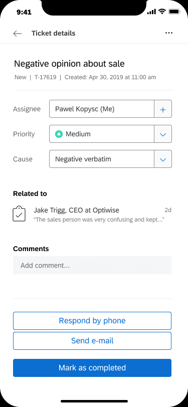
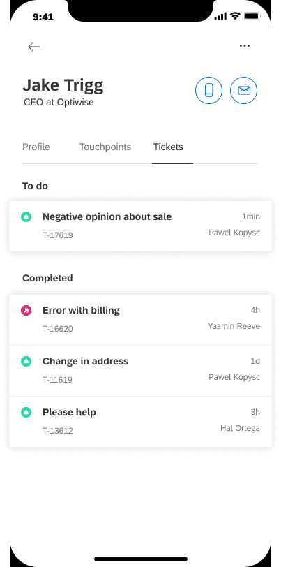
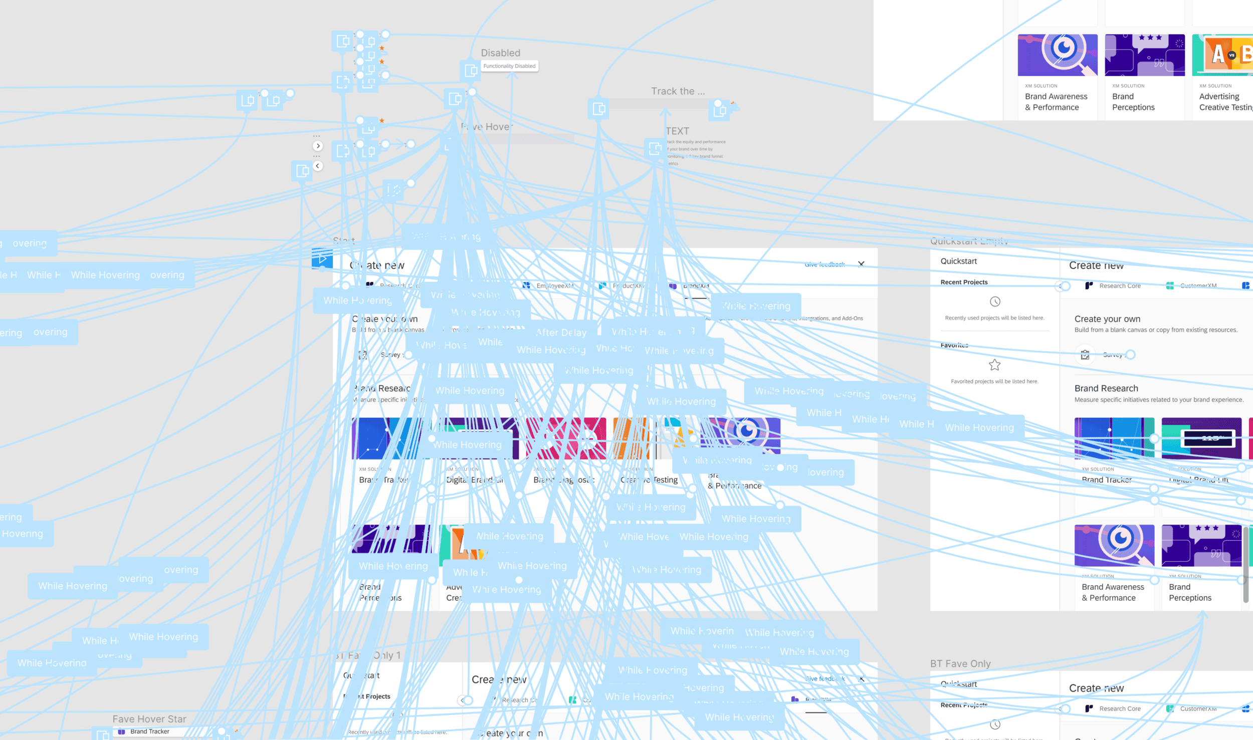
At Qualtrics, I helped modernize key parts of the platform—especially dashboards and the survey builder—by reducing complexity, aligning with the design system, and improving mobile usability. I led end-to-end UX improvements across layout, interaction, and onboarding. The redesign drove a spike in mobile dashboard usage and made the product more intuitive for both new and power users.

Full Case Study
🧩 Problem
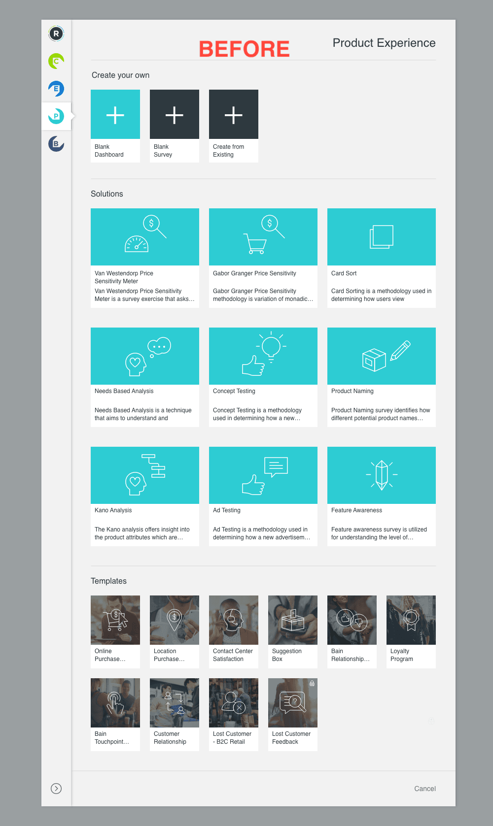
As Qualtrics expanded into a multi-solution platform, much of its core interface—particularly the dashboard and survey builder tools—lagged behind in usability and design consistency. Legacy components confused users, especially new or non-technical ones, and the product experience varied widely depending on where users were in the platform.
Mobile use was rising fast—especially among executives checking dashboards—but key tools weren’t responsive or intuitive across devices.
🚧 Challenge
Modernize core workflows without disrupting power users. The product needed to:
Unify outdated components under a scalable, modern design system
Simplify complex flows without removing advanced capabilities
Prioritize mobile experiences for on-the-go decision-makers
All while maintaining the flexibility enterprise users relied on.
🔍 Process
Research Methods:
Stakeholder Interviews: Aligned with cross-functional teams across verticals
Support Ticket Analysis: Identified recurring friction points
Competitive Benchmarking: Studied Medallia, Typeform, SurveyMonkey
User Feedback: Reviewed call logs and onboarding sessions
Key Insights:
Users felt disoriented in deep flows with little guidance
Inconsistent patterns broke mental models
Mobile usage was growing, but experience lagged
Users needed help making smart choices—not more complexity
Design Goals:
Simplify high-friction workflows
Align legacy tools with the Qualtrics design system
Create responsive, mobile-friendly layouts
Introduce guidance without adding overhead
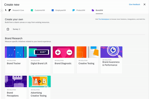
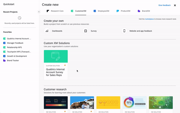
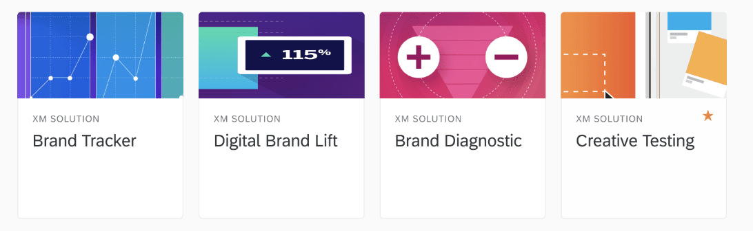
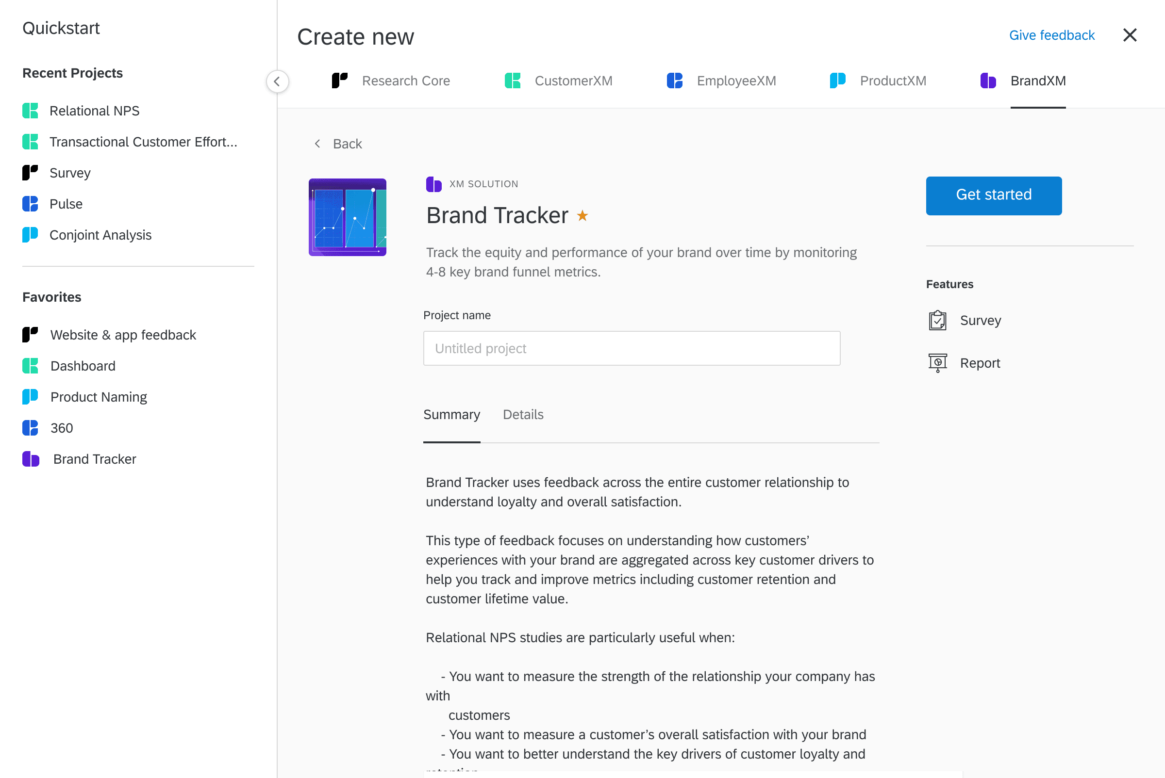
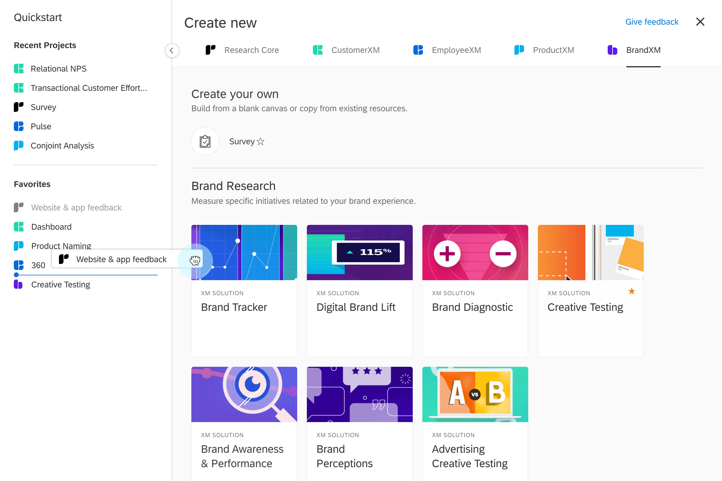
✅ Solution
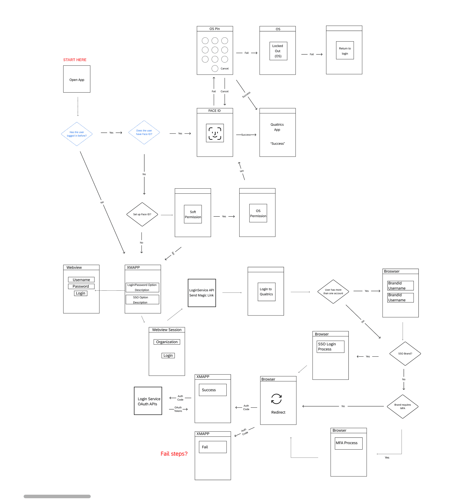
Survey Builder Improvements
Cleaned up layout with real-time previews
Smarter defaults and template starters
Contextual prompts and inline tooltips to guide users
Reduced clicks with autosave and inline editing
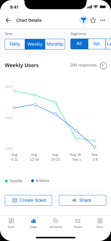
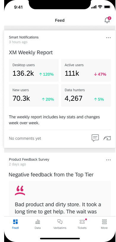
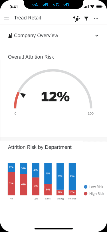
Dashboard Redesign
Drag-and-drop module editing with unified toolbars
Card-based, mobile-optimized layout for execs
Edit/view toggles and progressive disclosure of advanced settings
Design System Integration
Migrated outdated patterns to modern components
Standardized spacing, buttons, inputs, and iconography
Improved accessibility (contrast, type scaling, keyboard nav)
Mobile Optimization
Responsive layouts for survey editing and dashboard views
Tap-friendly targets and vertically stacked info blocks
Clear CTA placement across screen sizes
Validation & Testing
Conducted moderated usability sessions with internal teams and enterprise/edu users
Tested on dashboard builds, mobile workflows, and survey creation
Feedback showed improved clarity, reduced overwhelm, and faster task completion
📈 Impact
↓ Support Volume: Fewer tickets around dashboards and survey creation
↑ Mobile Use: Executive dashboard usage on mobile doubled post-launch
↑ Engagement: Power users explored new features more often
↑ Onboarding Success: New users completed setup faster with less help
↑ UI Consistency: Teams across Qualtrics adopted the new patterns
💭 Reflection
This work showed me how scale introduces friction—unless design actively fights it. Unifying tools under a consistent system helped restore user confidence, while thoughtful guidance and smart defaults made even complex tasks feel intuitive.
It wasn’t about simplifying everything—it was about simplifying the path to everything. Whether someone was building a survey from scratch or checking a dashboard on their phone, the goal was the same: make Qualtrics feel powerful, without making users work for it.