UI/UX Design
Arrive Logistics – Smarter Load Booking for Carriers
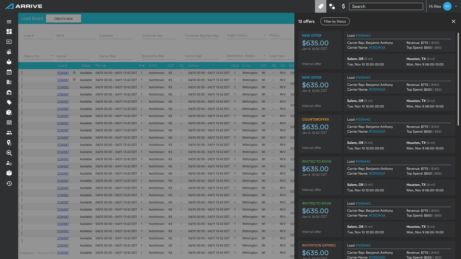
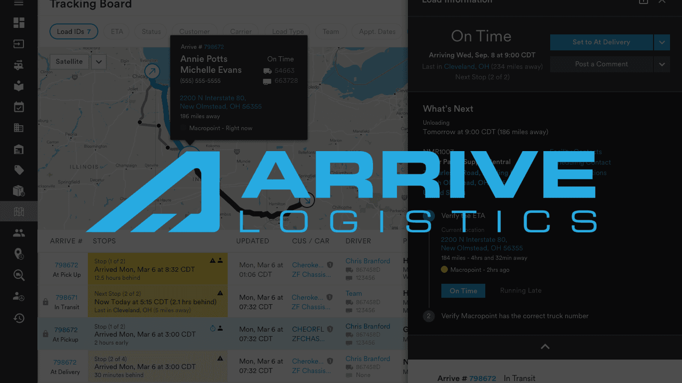
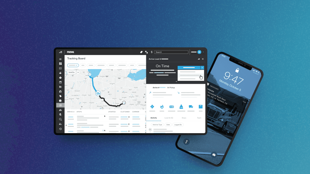
We redesigned Arrive’s load board to streamline the booking process for carriers—transforming it from a cluttered spreadsheet to a clean, mobile-friendly experience. By restructuring the layout, adding modular flyouts, and embedding key actions like booking directly into each row, we helped drivers find and book loads 45% faster. Mobile usage increased by 32%, and internal teams began using our system as a blueprint for other dashboards.
Full Case Study
🧩 The Problem
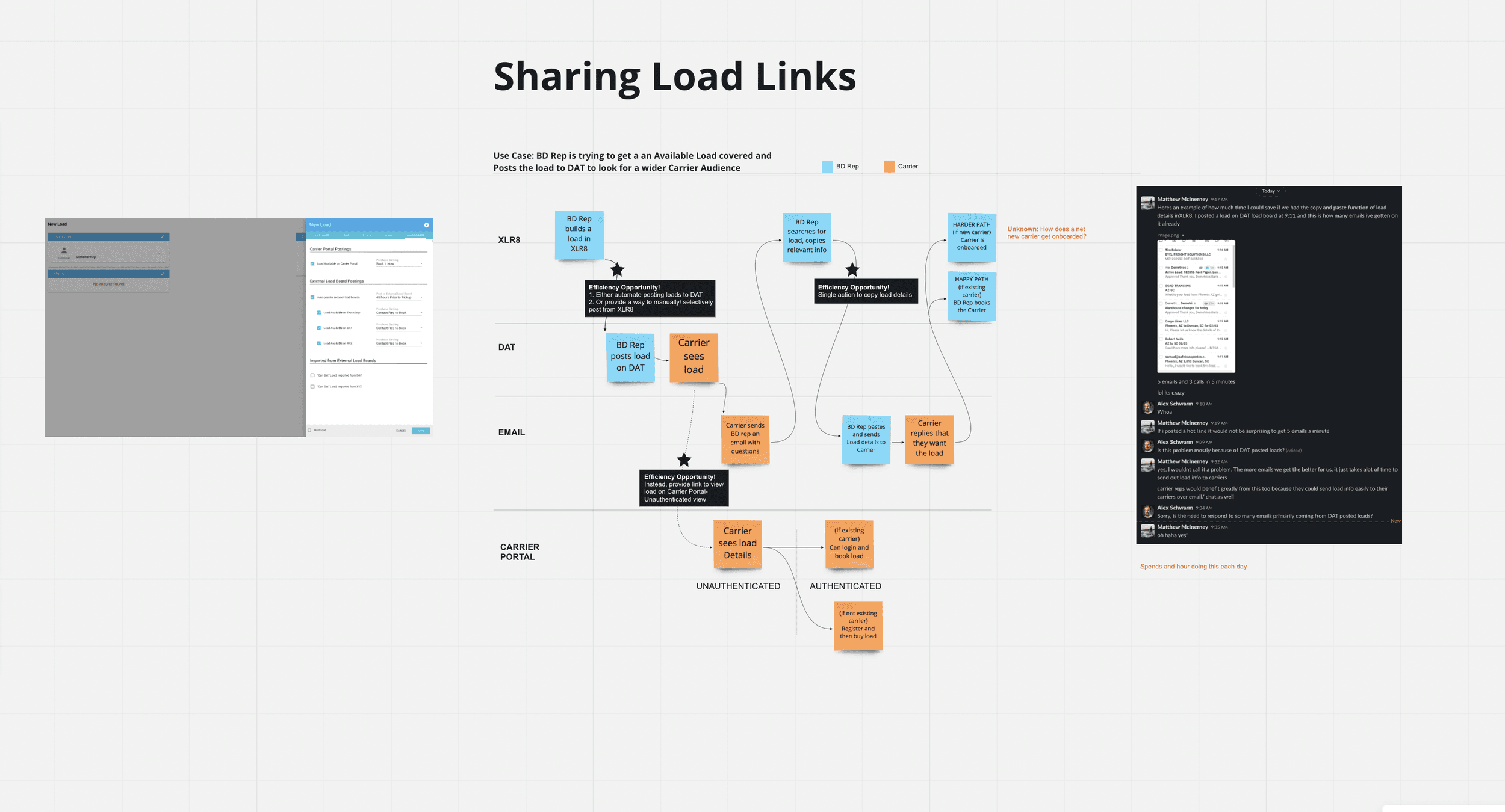
Arrive’s legacy load board looked and functioned like a cluttered spreadsheet. It lacked hierarchy, readability, and responsiveness—slowing down carriers who needed to quickly evaluate and book loads. Critical details were scattered across columns, and there was no mobile-friendly version, making it hard for users to operate efficiently on the go.
🚧 The Challenge
Reduce friction in the carrier booking journey by:
Reorganizing dense information for faster decision-making
Supporting mobile use cases
Improving the overall booking experience without overwhelming users
This wasn’t just a design issue—it was a business risk. Carriers were dropping off mid-task, calling support for clarification, and working across multiple tabs just to compare options.
🔍 The Process
Discovery & Research
Stakeholder Interviews – aligned on business goals and known pain points
Carrier Interviews & Shadowing – observed workflows and heard real feedback
Support Ticket Review – identified recurring user frustrations
Competitive Analysis – benchmarked platforms like DAT, Convoy, Uber Freight
Heuristic Audit – captured UI and interaction gaps
Key Insights
Carriers wanted instant clarity: “what is this load, is it worth it, can I book it?”
Current layout caused cognitive overload
Mobile users were completely unsupported
Critical actions like “Book” or “Hold” were buried or on separate screens
✅ The Solution
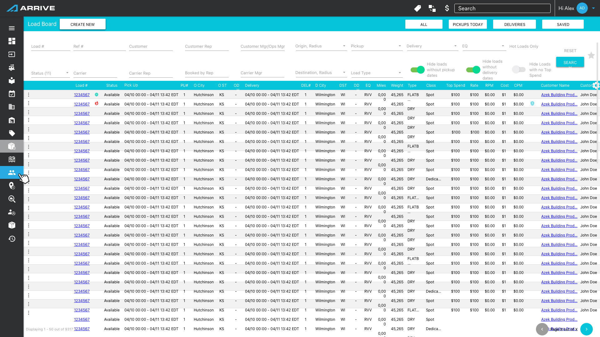
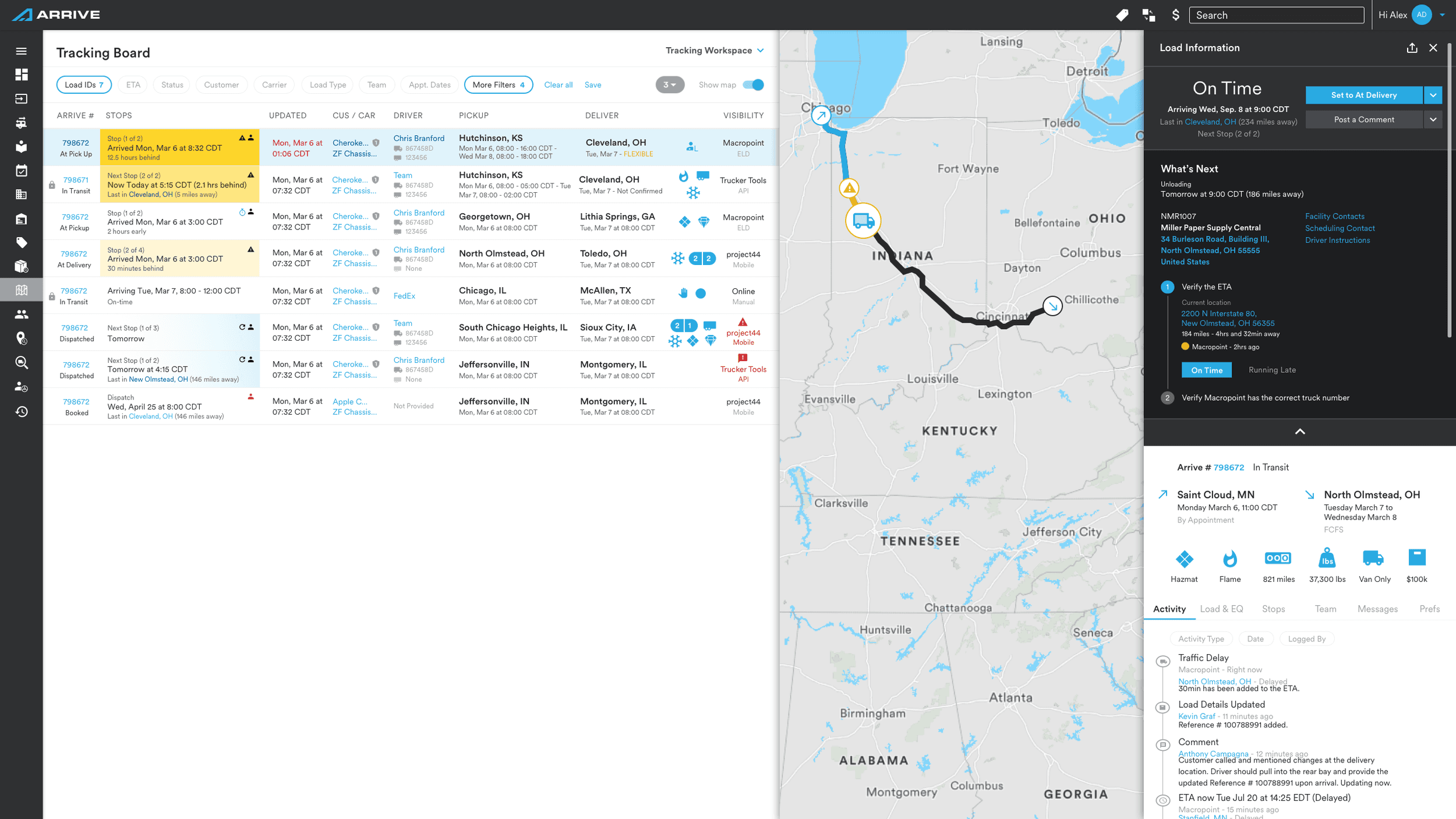
1. Smarter Layout & Modular Columns
Grouped info by how carriers think—route > rate/timing > actions. Reduced total columns by combining related data and applied visual hierarchy through spacing and typography.
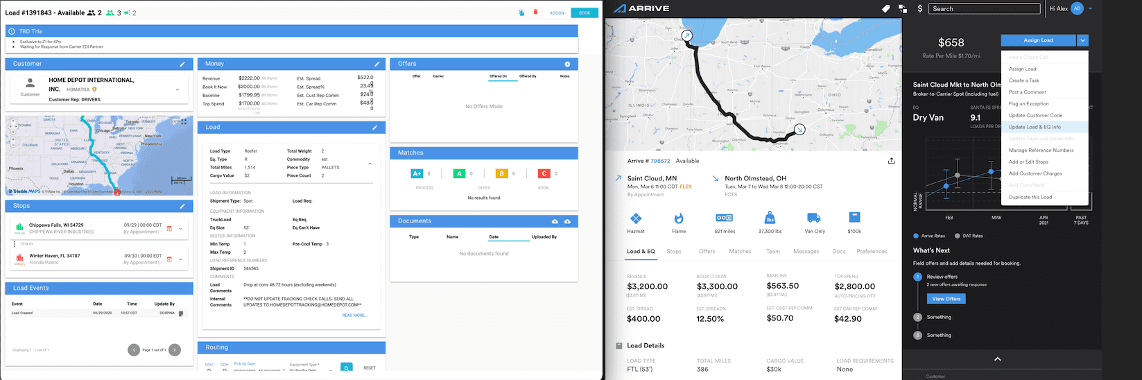
2. Flyouts & Hover States for Context
Introduced expandable flyouts for load details (equipment, broker notes) and hover cards for quick glances (e.g., transit time). This allowed users to go deeper without cluttering the table.
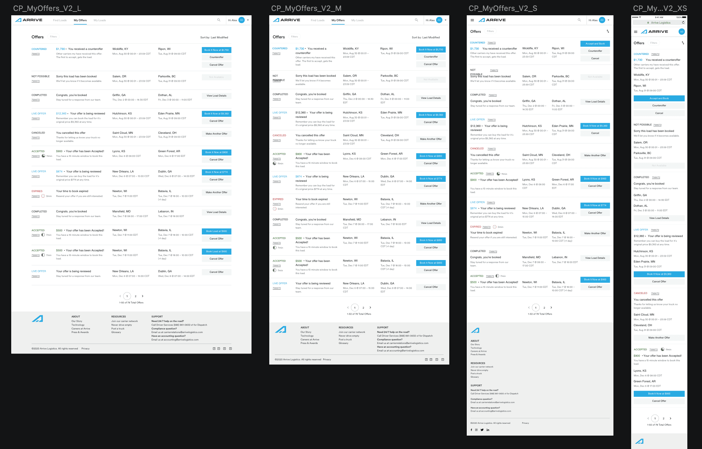
3. In-Row Booking Actions
Embedded key actions like “Book,” “Hold,” and “Message” directly into each row—reducing page changes and speeding up workflows.
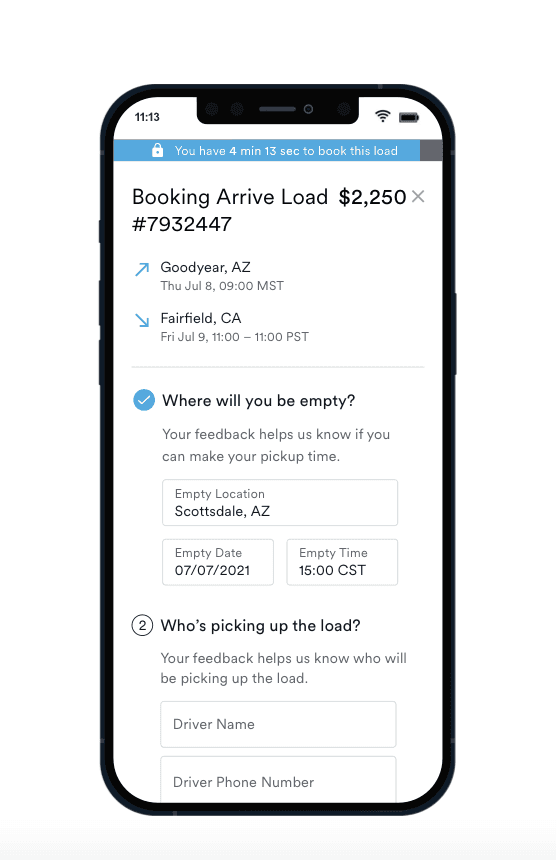
4. Responsive Mobile Design
Rebuilt the experience for mobile with stacked layouts, larger touch targets, and preserved core functionality for carriers on the road.
5. Advanced Filters & Sorting
Revamped the filter panel with grouped options, live updates, and saved views for power users.
6. Visual Refresh for Clarity
Unified icons and button behavior
Clean type hierarchy for fast scanning
Load status indicators (e.g., pending, booked, held)
Muted colors for reduced fatigue
7. Usability Testing & Iteration
Two full testing cycles with carriers
Tasks included load comparison, filtering, and mobile booking
Feedback drove refinements to flyouts, spacing, and responsiveness
📊 Results & Impact
45% faster booking times during testing
32% increase in mobile usage
Fewer support tickets, especially around booking confusion
Higher carrier satisfaction in post-launch surveys
System adopted internally for redesigning other Arrive dashboards
💭 Reflection
This project was a lesson in clarity over complexity. Carriers didn’t need bells and whistles—they needed a tool that respected their time and helped them act with confidence. Designing for high-pressure, transactional environments taught me how to create fast, intuitive UIs that fade into the background and let the work take center stage.