UI/UX Design
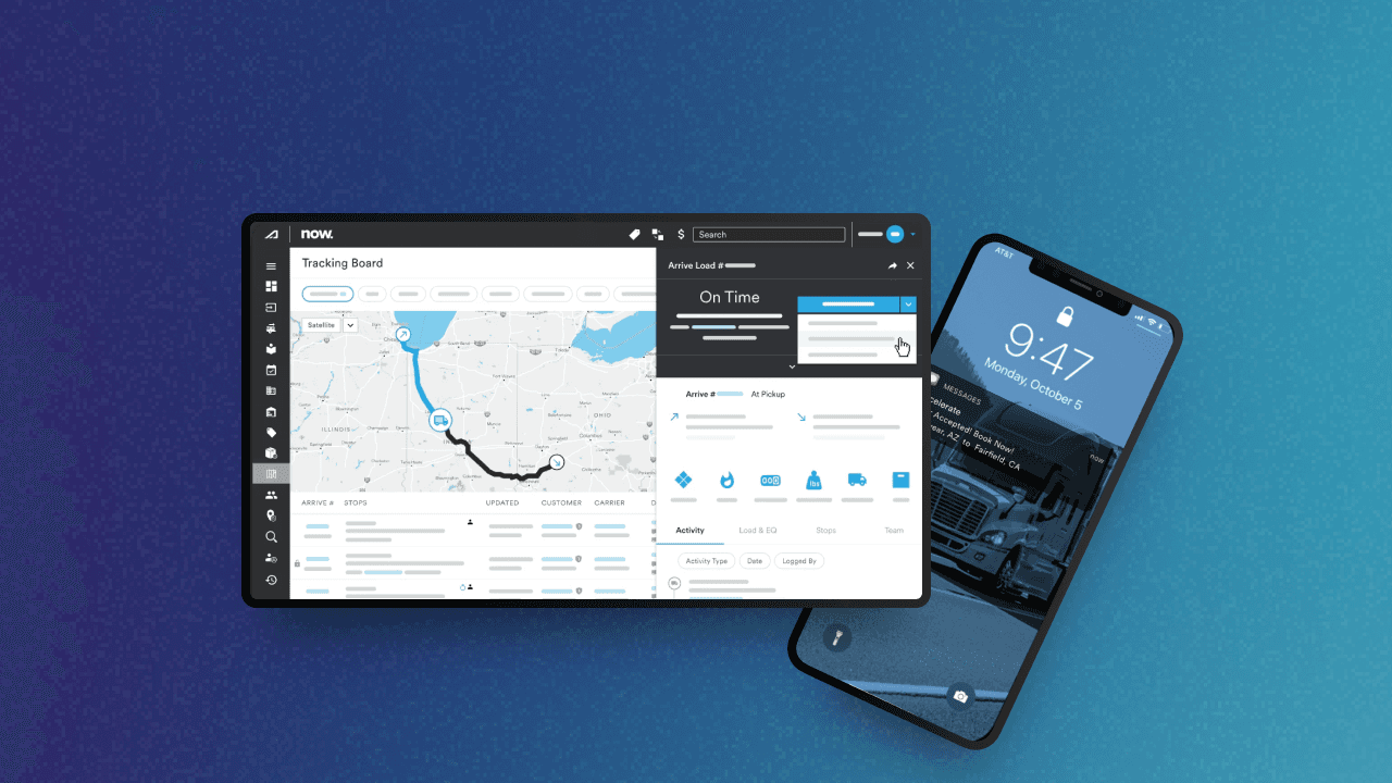
Punchh – Modular Mobility
As Lead Mobile UX Designer at Punchh, I rebuilt our white-label app framework from the ground up—designing a modular system that was fast, intuitive, and brand-flexible. From user research to UI design and prototyping, I led the full redesign to support loyalty, ordering, and rewards across dozens of retail and restaurant apps. The result: a faster user experience, improved retention, and a mobile system that scaled beautifully without sacrificing brand identity.

Full Case Study
🧩 Problem
Punchh’s mobile loyalty app framework—used by major restaurant and retail brands—was starting to feel outdated. It didn’t follow modern mobile design patterns, was difficult to customize, and couldn’t keep up with post-COVID shifts in user behavior.
Ordering had moved online, loyalty expectations had changed, and mobile-first interaction was now the norm. The app’s rigid architecture made even basic improvements hard to scale across clients.
🚧 Challenge
Redesign the mobile framework to:
Support modern mobile UX standards
Enable deep brand customization without rebuilding from scratch
Improve user engagement in ordering and rewards
Create a reusable system that scaled across dozens of unique client apps
This meant balancing visual polish, technical feasibility, and brand-level configurability—all within a lean team and fast-paced roadmap.
🔍 Process
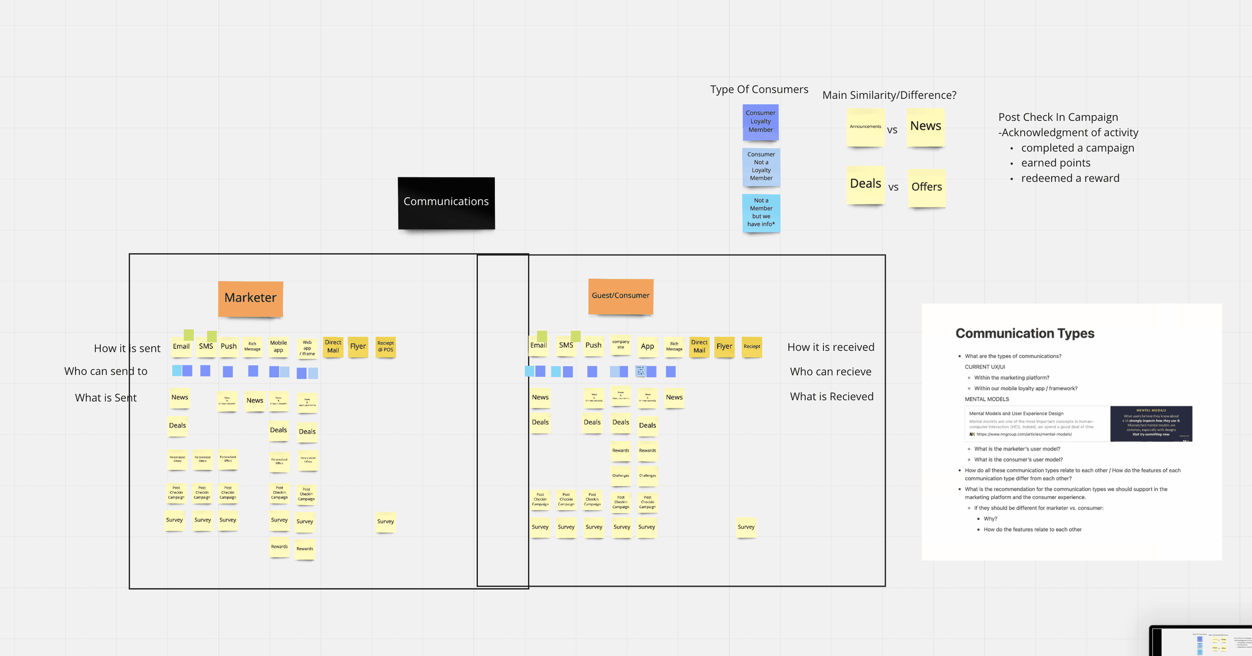
User + Client Research
I led discovery across multiple stakeholder groups to identify pain points, expectations, and scalability needs.
Methods Included:
User Studies on reward flows and ordering friction
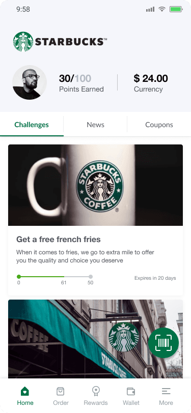
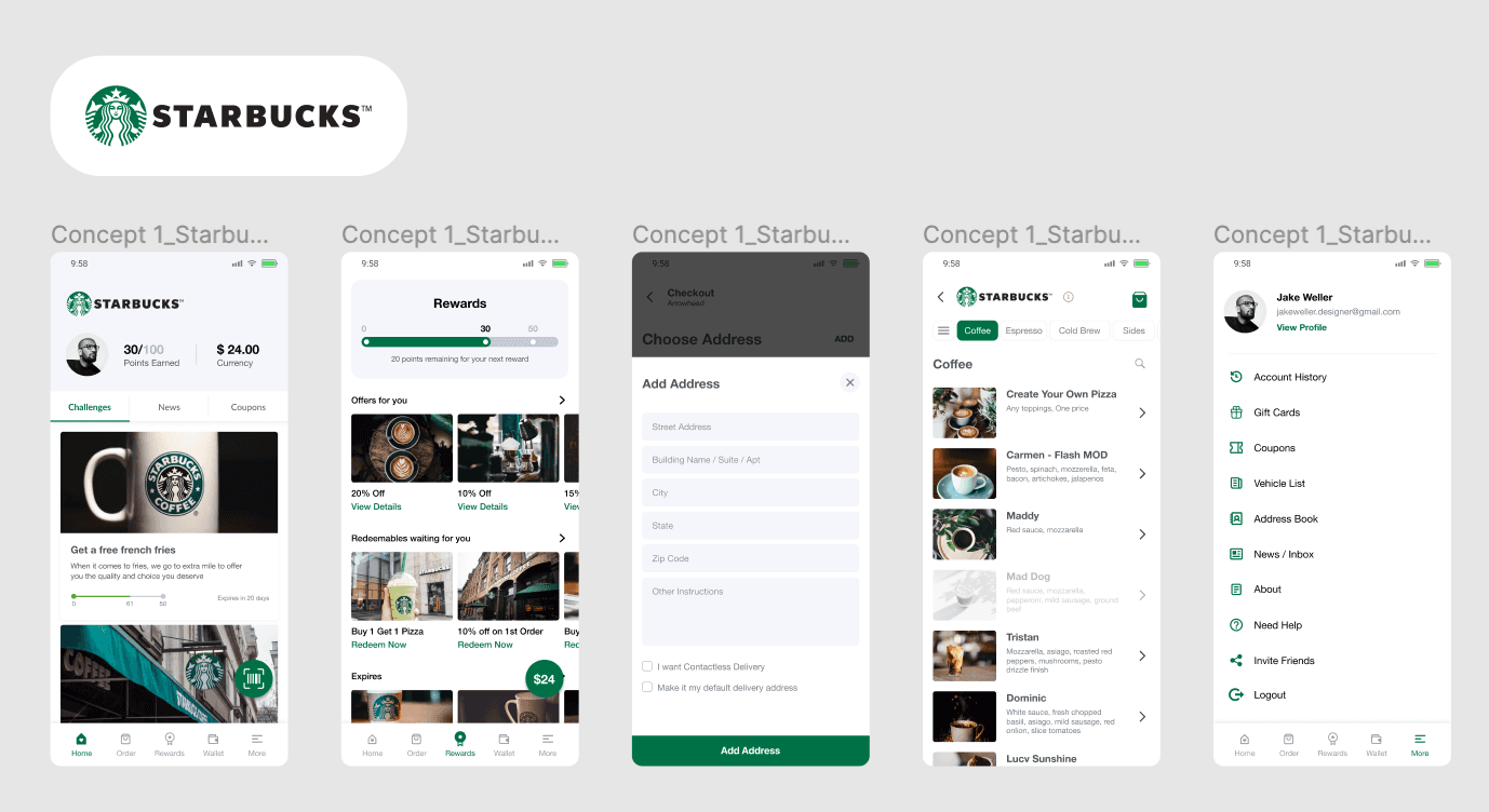
Competitive Analysis of best-in-class apps (Starbucks, Chick-fil-A, McDonald’s)
Client Interviews across QSR and casual dining brands
Internal Feedback from PMs, engineers, and customer success
Key Insights:
Users wanted faster access to rewards, fewer steps to order
Clients demanded visual flexibility and brand expression
Navigation and layout needed to support modularity
“Template fatigue” was real—brands wanted apps that felt truly theirs
✅ Solution
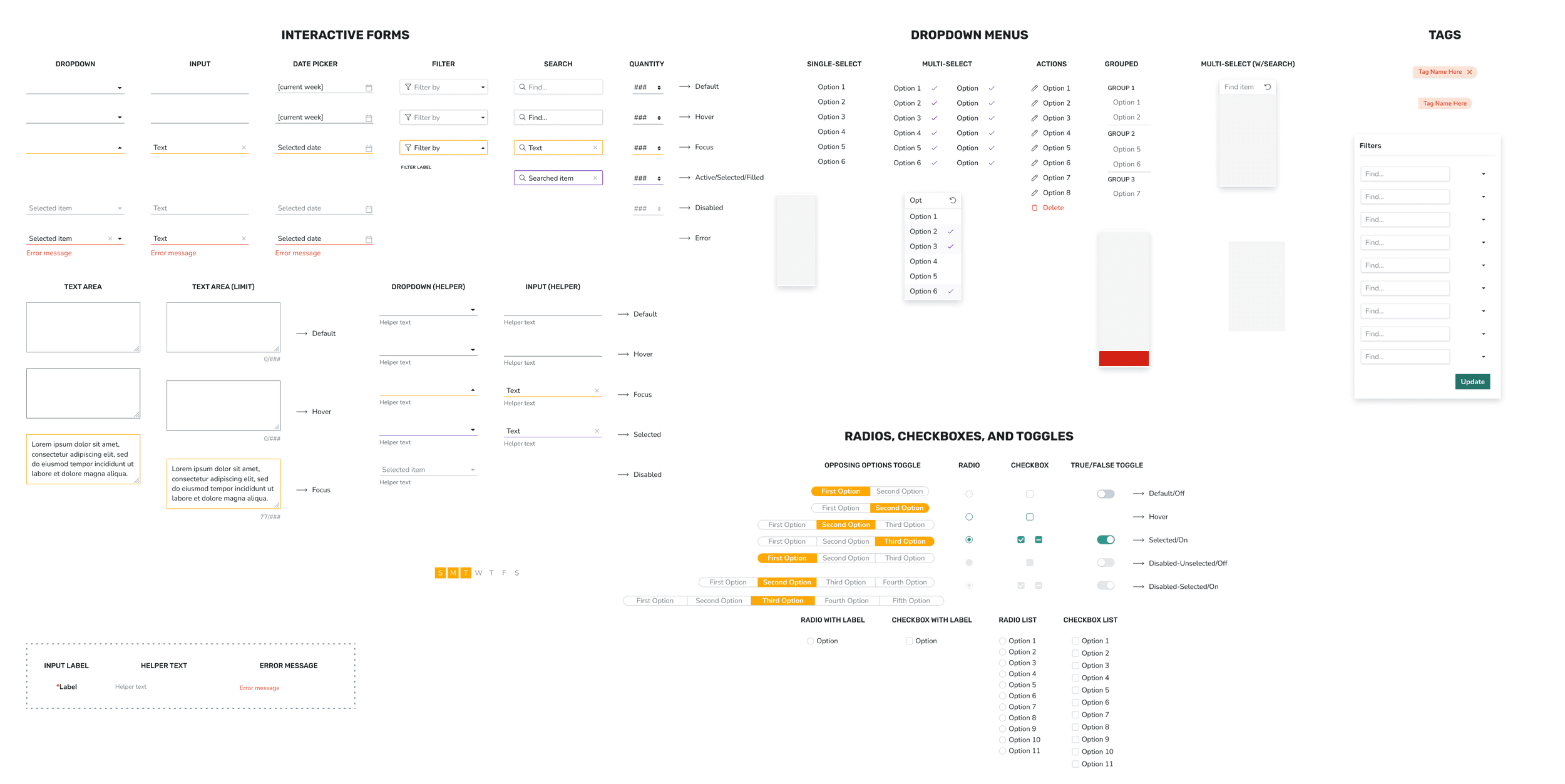
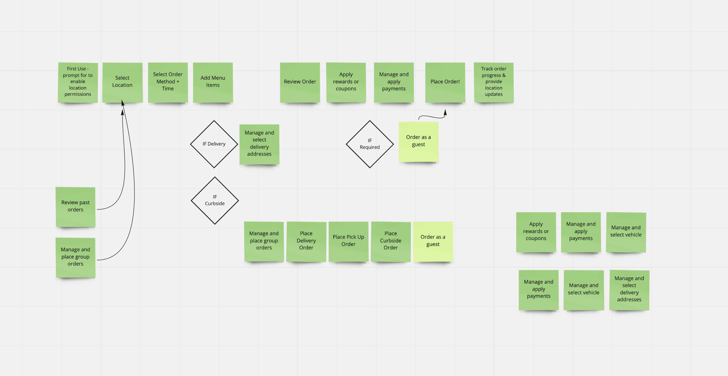
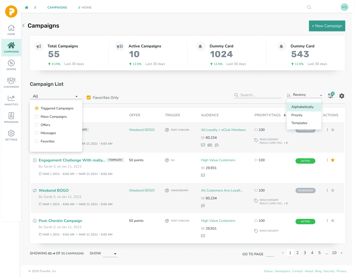
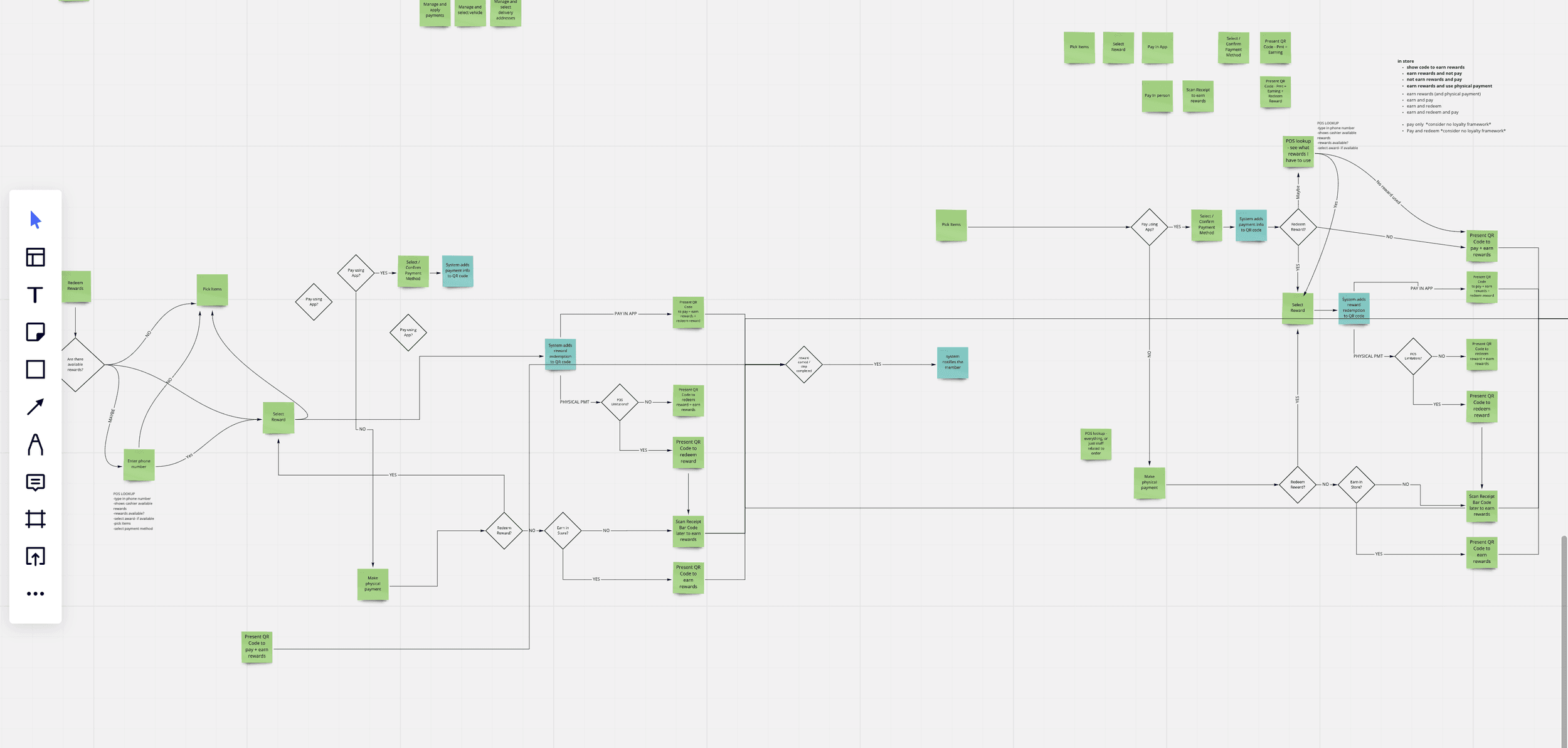
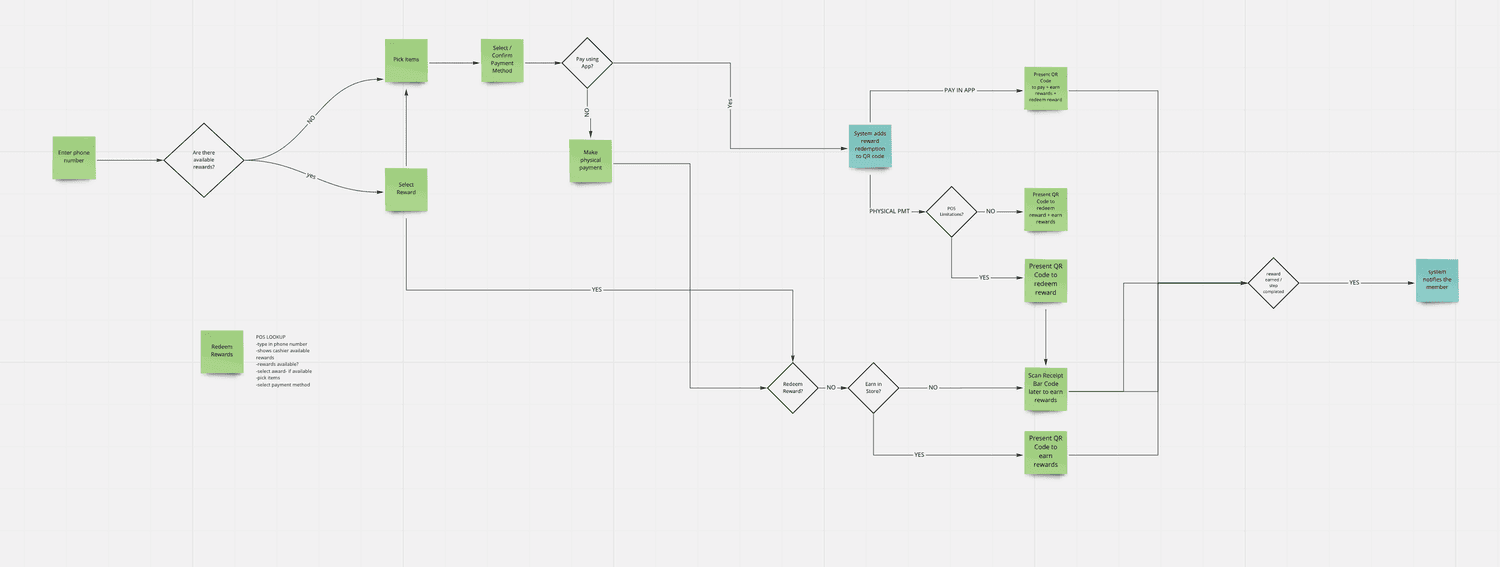
1. Modular UI Framework
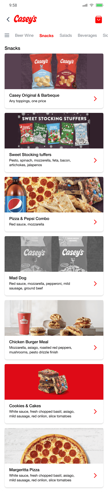
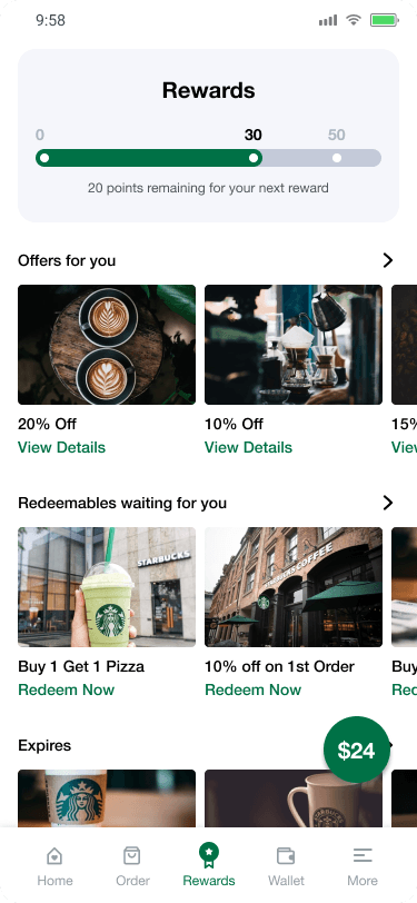
Created a flexible, component-based architecture with swappable modules for navigation, promotions, rewards, and home layouts.
Bottom nav with customizable icons and priorities
Loyalty components (tiers, punch cards, point-based)
Skinnable design system for colors, type, icons
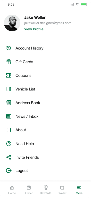
2. Simplified Navigation & IA
Reorganized the core flow to reduce taps and surface key actions
Home → Order → Pay/Rewards → Confirmation
Grouped account settings into clean, task-based sections
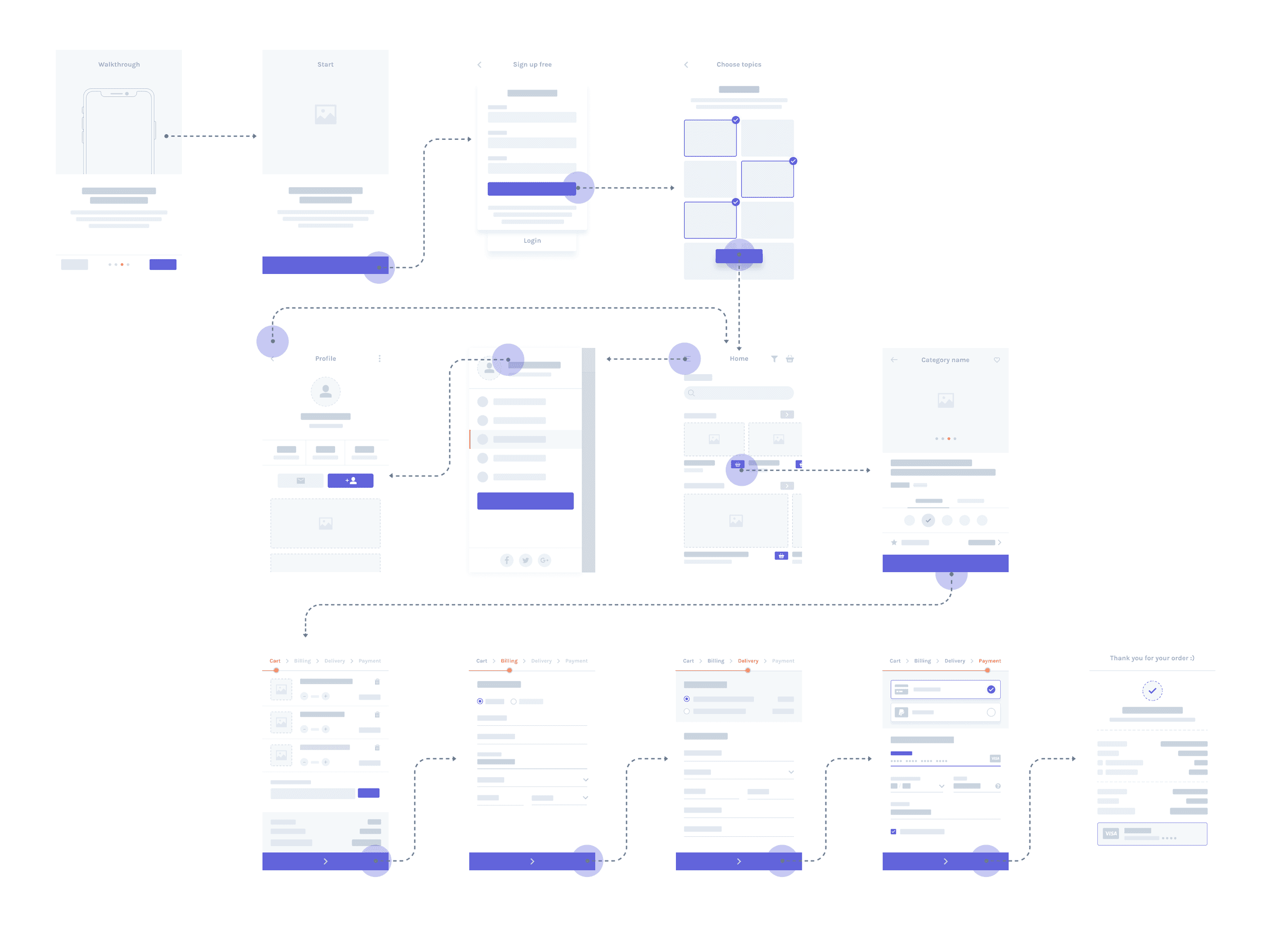
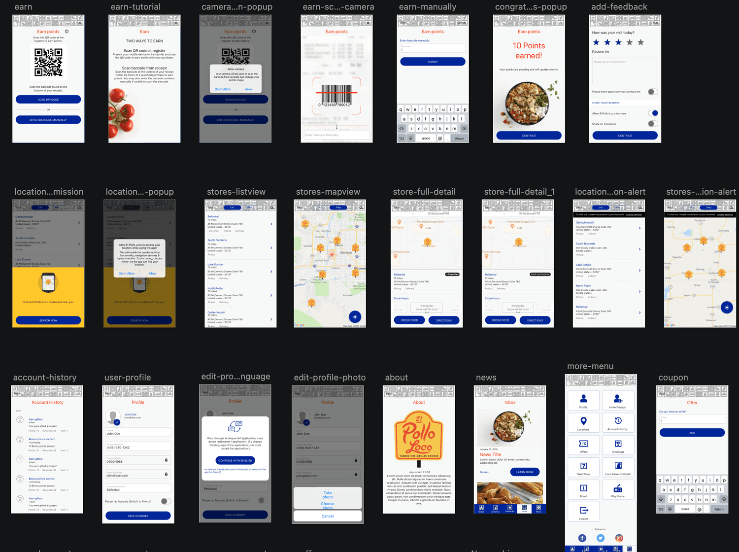
3. Mobile-First Visual System
Designed a clean, scalable aesthetic that emphasized clarity and action:
Larger tap targets and mobile OS-consistent gestures
Lightweight iconography and whitespace for focus
Color-coded states for feedback (available rewards, errors, confirmations)
4. Custom Branding Tools
Enabled client-level visual control without code rewrites:
Dynamic themes, font overrides, and icon sets
Promo card modules with flexible layouts and CTA types
5. Prototyping & Validation
Built high-fidelity Figma prototypes and ran usability tests
Conducted client walkthroughs for configuration feedback
Partnered with engineers to stress-test modularity in implementation
📊 Results & Impact
User Impact:
Reward redemption completion rate ↑ 30% during testing
Users praised “faster feel” and home screen clarity
Higher engagement with in-app promos and loyalty tracking
Client Outcomes:
Faster setup = quicker time-to-launch for new clients
More flexible branding tools led to ↑ client satisfaction
Sales demos saw increased conversion due to polished UX
Business Value:
Reduced engineering lift via reusable modular components
Stronger position as a digital loyalty leader
Framework supported both scale and personalization—without trade-offs
💭 Reflection
This project was a crash course in balancing standardization and personalization. Every brand wanted their app to feel unique—while we needed to ship scalable, efficient design. That tension shaped how we built everything.
The biggest takeaway? Modularity isn’t just a backend concern—it’s a UX superpower. When you design systems that flex with business needs and feel intuitive to users, you create apps that don’t just function—they resonate.
Designing mobile-first taught me to prioritize clarity, speed, and delight—especially in loyalty experiences where the reward should always feel earned, not hard to find.