Published Apr 8, 2022
Arrive Logistics
As the internet continues to develop and grow exponentially jobs related to the industry do too...
Project Overview
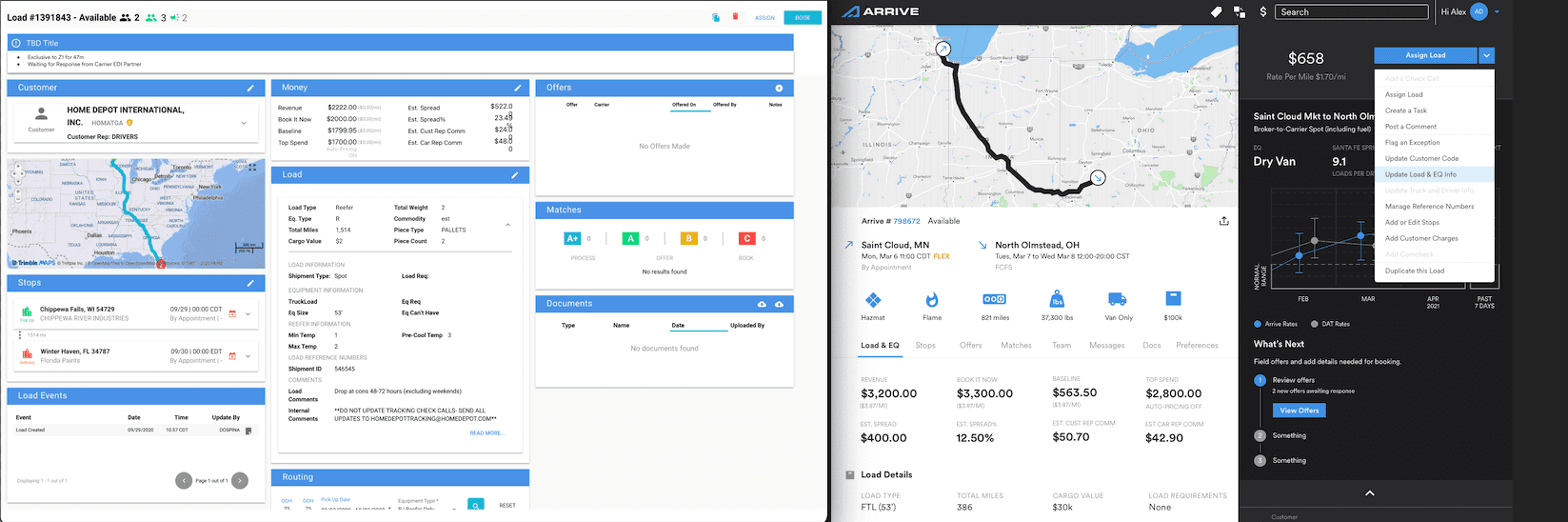
Arrives load (dash) board was dated and looked very similar to an excel spreadsheet. This made it much harder for carriers to do their jobs properly as it took time to search for various bits of information.
🧩 The Challenge: Reducing Friction in the Booking Journey
Arrive’s load board was supposed to help carriers quickly find and book loads—but in reality, it was slowing them down.
The original interface looked more like an overgrown spreadsheet than a tool built for action. Critical details—like pickup/drop-off, rate, and timing—were there, but scattered across too many columns in no clear order of importance. Carriers had to mentally piece things together just to figure out if a load was worth taking.
This wasn’t just a UI issue—it was costing time, money, and trust. Drivers were dropping off mid-session, opening multiple tabs to compare loads, or calling support to interpret the platform. For a logistics company trying to scale, that level of friction wasn’t sustainable.
🔎 Discovery & Research
To really understand where carriers were getting stuck, I worked closely with product ops, engineering, and user research. We wanted the data, but we also wanted the human story behind it.
Research Methods:
Stakeholder Interviews – Aligned with internal teams to surface business goals, pain points, and feature gaps.
Carrier Interviews + Shadowing – Observed real dispatch workflows and spoke directly with drivers and fleet managers about daily usage.
Heuristic Audit – Documented design inconsistencies and poor interaction patterns.
Support Ticket Review – Analyzed frequent user complaints and common points of confusion.
Competitive Analysis – Looked at platforms like Uber Freight, Convoy, and DAT to understand market standards and where we could differentiate.
Key Findings:
Carriers needed instant clarity—what is the load, what’s it worth, and can I book it right now?
The scattered data layout slowed decision-making and created unnecessary mental strain.
Mobile workflows were nonexistent—yet many carriers were trying to book on the road.
Too many actions required navigating to other screens, adding friction at every step.
“This thing feels like it’s built for people who aren’t actually booking loads.” — Carrier
💡 Design Goals
Based on research, we focused our redesign around four core objectives:
Clarity: Make high-priority information obvious and easy to scan.
Speed: Reduce clicks, context-switching, and decision friction.
Responsiveness: Support a seamless experience across mobile, tablet, and desktop.
Scalability: Build a modular system that can evolve as needs and data grow.
✍🏽 UX Strategy & Execution
📐 Layout Redesign: Modular Column Architecture
We restructured the entire table layout by grouping columns based on the carrier’s mental model—starting with route info, followed by rate/timing, then actions. Instead of adding new elements, we combined and prioritized existing information within fewer columns, making it faster to assess load value at a glance.
Whitespace, spacing, and alignment were used to visually anchor decision-critical details like pickup windows, rate per mile, and distance.
🧩 Modular Flyouts + Hover States
Instead of navigating away to different pages, carriers could now access extended info through modular flyout menus—including equipment details, broker notes, or commodity type. These were triggered by simple icons, allowing for deeper interaction without cluttering the main view.
Hover states were also introduced to surface quick-hit insights like estimated transit times or broker ratings, further reducing the need to leave the page.
🔘 In-Row Actions
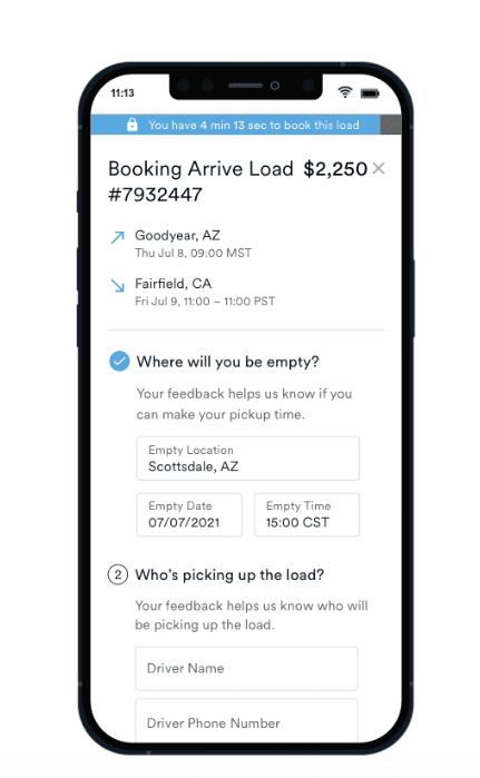
Common actions like Book, Message, and Hold were embedded directly into each row—so users could act immediately without getting redirected. This kept workflows tight and user context intact.
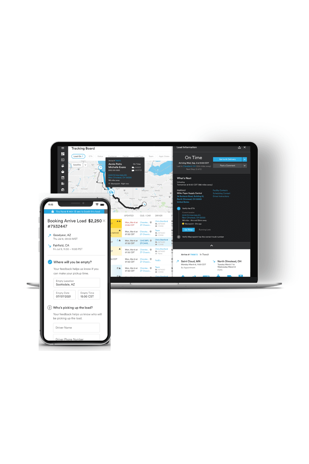
📱 Responsive Design for the Field
Many carriers accessed the load board from phones or tablets while on the road. We built a fully responsive version with touch-friendly controls and a vertically stacked layout. Key booking actions remained accessible, and the reflowed content made it easy to scan, compare, and book even on a 5-inch screen.
🧭 Advanced Filtering & Sorting
We overhauled the filtering panel to support real-time updates without reloads. Filters were grouped by use case (e.g., price, time, region) and designed for future expansion—including saved views and preference recall. Sorting and filtering were optimized for both mobile and desktop.
🎨 Visual Refresh
We didn’t aim for flashy. Instead, we focused on functional clarity:
Unified iconography and streamlined button behaviors
Updated type hierarchy to emphasize critical values
Softened the color palette to reduce visual fatigue during long sessions
Introduced load status colors (e.g., held, booked, pending) to improve at-a-glance comprehension
🧪 Testing & Iteration
We tested both desktop and mobile prototypes using Figma and conducted two full usability cycles.
Usability Testing:
Participants: Arrive Carriers
Tasks: Find best load, compare loads, filter for rate + location, complete booking
Focus Areas: Task speed, confusion points, visual hierarchy, mobile accessibility
Insights:
Carriers immediately noticed the reduction in clutter and improved scannability
Modular flyouts were praised for “not getting in the way but being there when needed”
Booking directly from the table was a clear win—no more bouncing between tabs
Mobile users finally felt like the product worked for them, not just desktop teams
“This is way easier to use. I can actually book while I'm in my truck without calling dispatch.” — Carrier
✅ Final Design Outcomes
Key Enhancements:
Smarter column prioritization for faster load assessment
Modular flyout menus and hover states for contextual depth
In-line booking and messaging to cut down navigation time
Responsive layout that worked seamlessly on phones and tablets
Clean, accessible UI that was easy to onboard for new users
📈 Post-Launch Impact
+45% faster booking completion in testing
32% increase in mobile usage, especially among small fleet drivers
Fewer “how-to” tickets, freeing up support team resources
Higher satisfaction scores from carrier feedback surveys
Internal teams began applying the modular layout system to other dashboards
💭 Reflections
This project reminded me that clarity beats complexity every time. Carriers didn’t need more features—they needed tools that respected their time, gave them confidence, and let them work without second-guessing the interface.
Designing for logistics taught me how urgency, trust, and simplicity show up in the tiniest UI details. When your users are under pressure to make fast decisions, the best design is the one that gets out of their way.