Published Jan 12, 2022
Tripping
Tripping.com was an online search engine and aggregator for vacation rentals.

Project Overview
In this role, I led a full redesign of the website and took ownership of several projects—big and small. Aside from my manager, I was the only designer on the team, which gave me the chance to make a real impact, especially since this was my first official UX role.
Before I joined, there hadn’t been any dedicated UX design work done on the product, so I started from the ground up—revamping everything from the homepage to the listing pages. Our goal was to create a cleaner, more modern experience that made it easy for users to find what they needed, whether they were on desktop or mobile.
Like most redesigns, this one came with a few unexpected twists. One challenge we faced was image quality. Because Tripping is a vacation rental platform, many of the listing photos were user-uploaded—and not always the best quality. To improve this, we integrated machine learning to automatically rank and display higher-quality images first. It made a noticeable difference in both engagement and conversions.
🎯 The Challenge: Building Trust in a High-Stakes Space
In the competitive world of online travel, first impressions make or break trust. And the platform I was working on was falling short.
From inconsistent branding to cluttered navigation, the experience gave users mixed signals—especially on key pages like the homepage and search results. It wasn’t just a visual problem. Bounce rates were high, listing engagement was low, and users weren’t confident enough to move forward in the booking flow.
As more users landed on the site through mobile and ads, our challenge was clear: create a high-trust, modern experience from the moment someone lands—one that makes comparing listings and making decisions feel seamless.
🔎 Research & Discovery
To understand where users were dropping off—and why—I collaborated with product managers, support leads, and data analysts to piece together the full picture.
Research Methods:
User Feedback Review: Partnered with the support team to surface recurring complaints, confusion points, and friction in the booking process
Funnel Analysis: Used product analytics to identify drop-off rates from homepage → search → listing view
Competitive Benchmarking: Studied platforms like Airbnb, Booking.com, and Vrbo to understand what users had come to expect in terms of filtering, visual polish, and pricing clarity
Key Insights:
Users expected a clean, trustworthy interface immediately—especially before providing personal or payment information
The filter experience felt disjointed and forced users to restart or backtrack often
Cluttered UI with multiple competing CTAs caused decision fatigue
Pricing presentation lacked transparency—users weren’t sure whether they were comparing nightly rates or total trip cost
“I didn’t know where to look first... it felt a little sketchy.”
— User Feedback, Support Transcript
🧭 Design Goals
Based on discovery and user feedback, we focused our UX efforts on three key priorities:
Establish Credibility: Use consistent visual branding and hierarchy to build trust from the first click
Simplify Search & Filtering: Make it easier to refine results without breaking flow
Reduce Cognitive Load: Clean up the interface and guide users clearly toward key actions
💡 Design Strategy
With a small team and limited engineering bandwidth, we prioritized high-impact changes that could scale, starting with the core conversion journey: homepage → search results → listing.
Key UX Decisions:
🎨 Unified Visual Language
Created a lightweight design system including type scales, icons, button states, and spacing rules
Built reusable components for search cards, filters, and CTAs
Ensured consistency across homepage, results, and listing views
🔍 Search Refinement Overhaul
Introduced a sticky filter bar with default suggestions and location-aware prompts
Added smart quick-start filters like “Popular Near You” and “Last-Minute Deals”
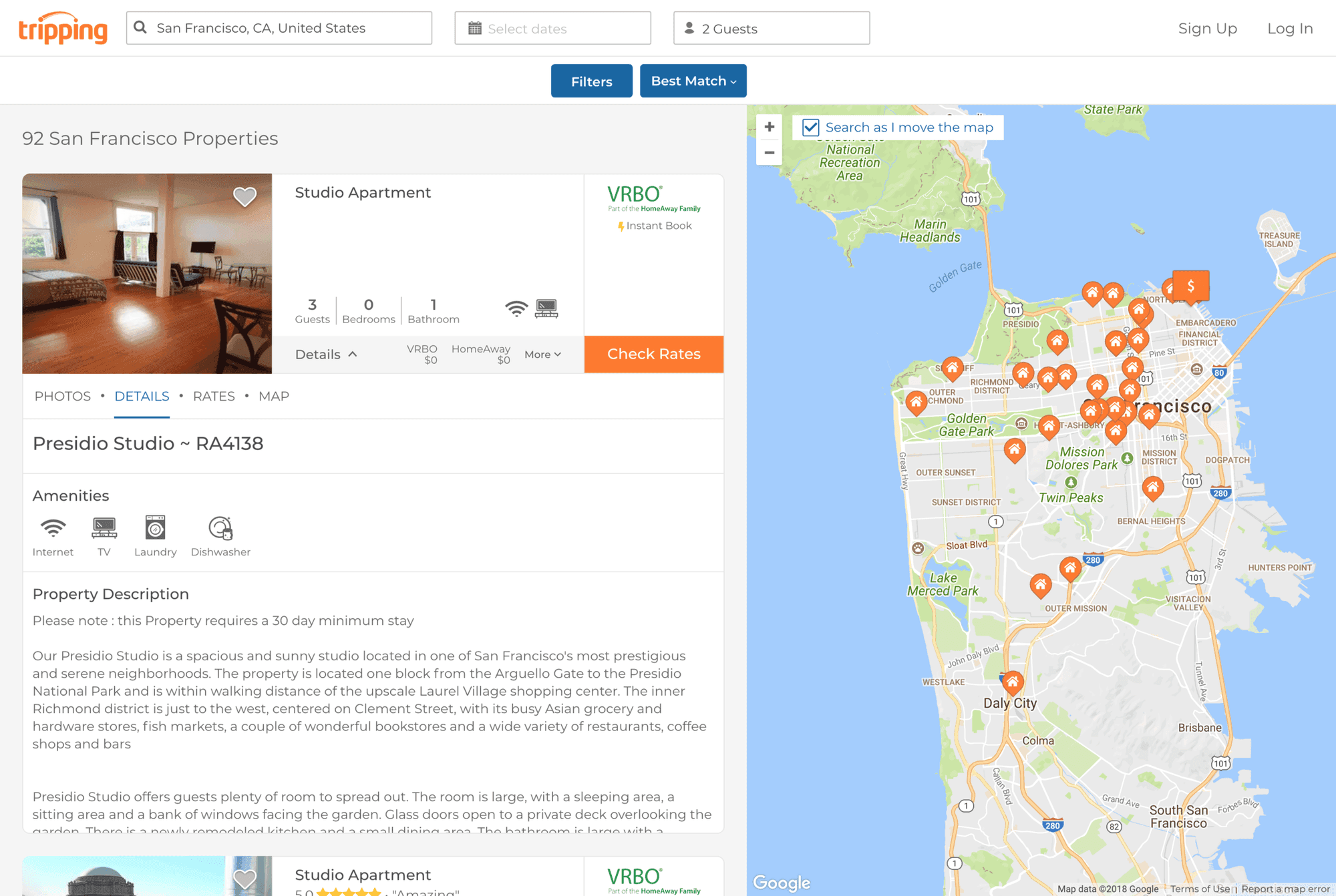
Consolidated search options into one place—no more jumping between screens
🧳 Comparison-Friendly Layouts
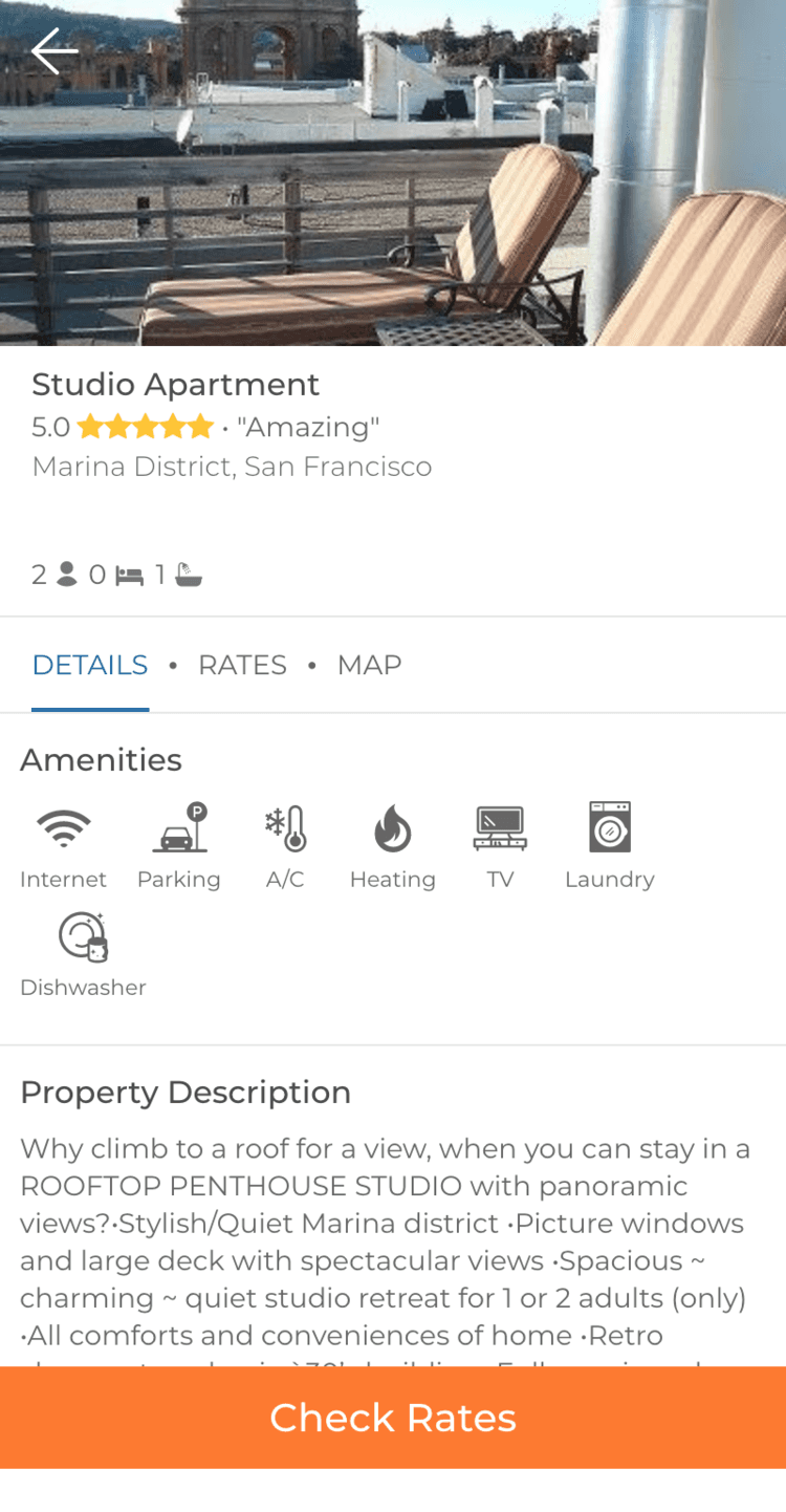
Switched to visual listing cards with hover previews showing key info (price, amenities, distance, rating)
Added transparent pricing labels, clearly showing total vs. nightly rates
Cleaned up the top nav and minimized distractions to keep users focused
🧪 Prototyping & Testing
I built interactive, responsive prototypes in Figma and conducted remote testing with real users to validate our assumptions.
Prototype Scope:
Homepage
Search results page
Listing detail view
Responsive layouts for tablet and mobile
Usability Testing:
Tasks: Filter results, compare 2–3 listings, choose a listing to book
Metrics: Task completion time, user confidence, pricing comprehension
Feedback themes: Trustworthiness, ease of comparison, clarity of flow
Key Learnings:
Users immediately felt more confident in the updated experience—calling out the design as “cleaner” and “more professional”
The sticky filter bar was a standout—it prevented users from getting lost mid-search
Hover previews made comparison faster without forcing extra clicks
Clearer pricing labels reduced hesitation and increased time spent on listings
“Pricing finally makes sense. I don’t feel like I’m being tricked.”
— User Tester, Remote Session
✅ Final Design Solution
🔧 Core Features:
Consistent Visual System: Unified colors, icons, type, and button styles across the site
Smart Filter Interface: Sticky search refinement bar with dynamic suggestions and saved filter memory
Simplified Listing Cards: Clean, visual layout with faster comparisons and key details up front
Decluttered Navigation: Reduced header noise, streamlined CTAs, and clearer entry points to listings
🎨 Visual Enhancements:
Modernized the look with subtle shadows, hover states, and clean cards
Prioritized hierarchy with whitespace, contrast, and simplified content blocks
Applied clear grouping of key vs. secondary information to reduce overwhelm
📊 Results & Impact
🚀 Engagement Wins:
Lower bounce rates on homepage and search results
Higher click-through rates on listings and featured sections
Improved post-session trust scores in user surveys
💬 User Feedback:
“It looks way more professional now.”
“Filters were easy to adjust—didn’t have to start over every time.”
“The new layout makes it easier to compare without second-guessing.”
💭 Reflections & Learnings
Redesigning the top of the booking funnel reminded me just how much visual polish and simplicity can impact trust. In industries like travel, users are handing over both money and personal information—so the interface has to feel safe as much as it functions well.
The biggest wins weren’t flashy—they were structural: spacing, filter UX, pricing labels, and layout consistency. These small shifts led to clearer comparisons, lower hesitation, and more confident bookings.
“The smallest changes—like spacing or filter copy—had the biggest impact on user confidence.”