Published Mar 15, 2022
Qualtrics
Qualtrics is a simple to use web-based survey tool to conduct survey research, other data collection activities.
Project Overview
My time at Qualtrics was both foundational and fast-paced. I joined during a period of early momentum—right before the company entered its major growth phase—which gave me a unique opportunity to work on a broad swath of the product and have a direct hand in shaping its user experience.
As part of a leaner design team, I was involved in everything from wireframing and prototyping to research and iteration, often working cross-functionally with engineering and product leads. Whether it was helping reimagine complex workflows or tightening up legacy components, I had the chance to learn deeply about enterprise-scale UX design while making tangible improvements to the platform.
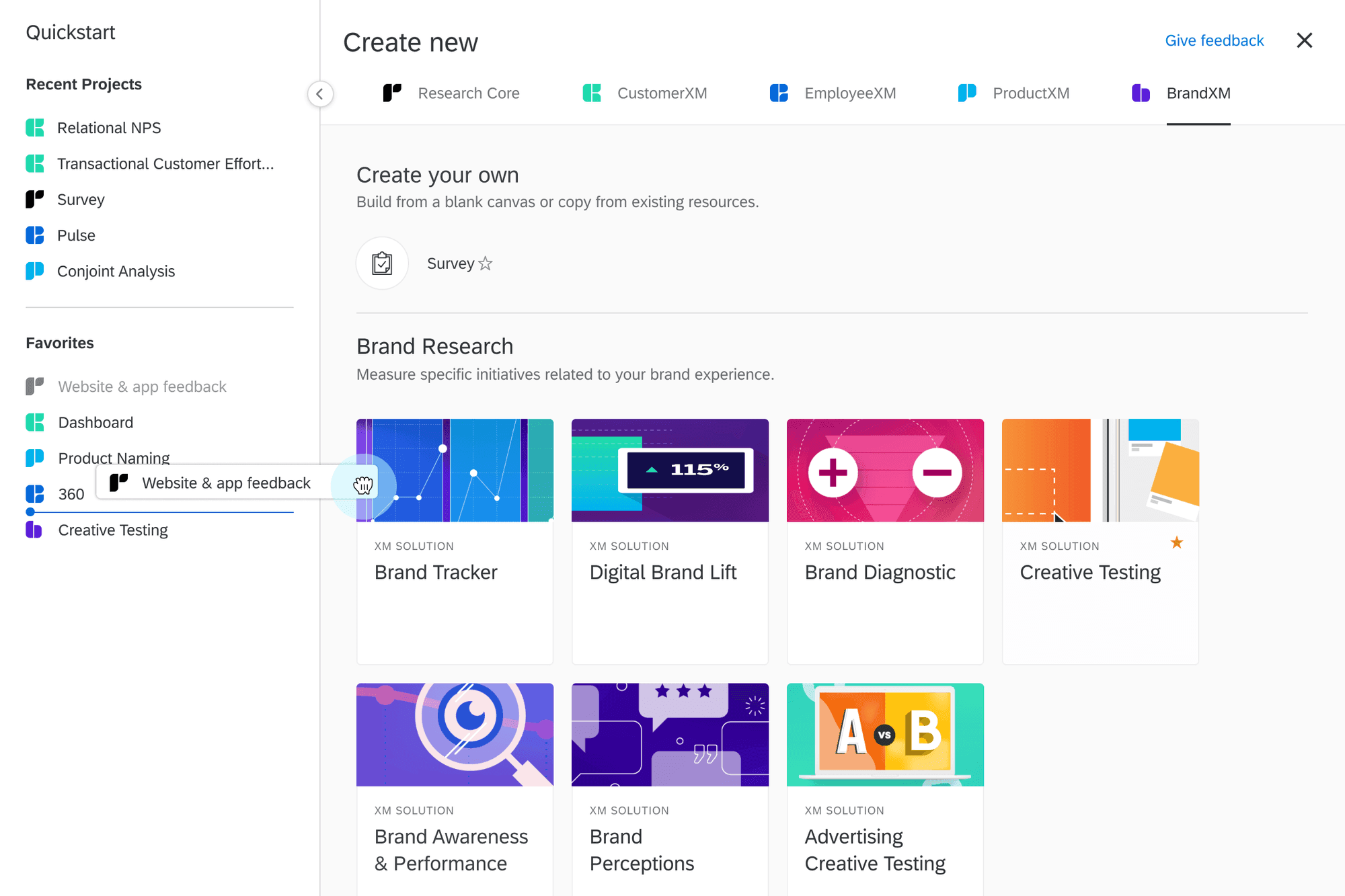
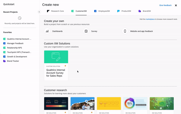
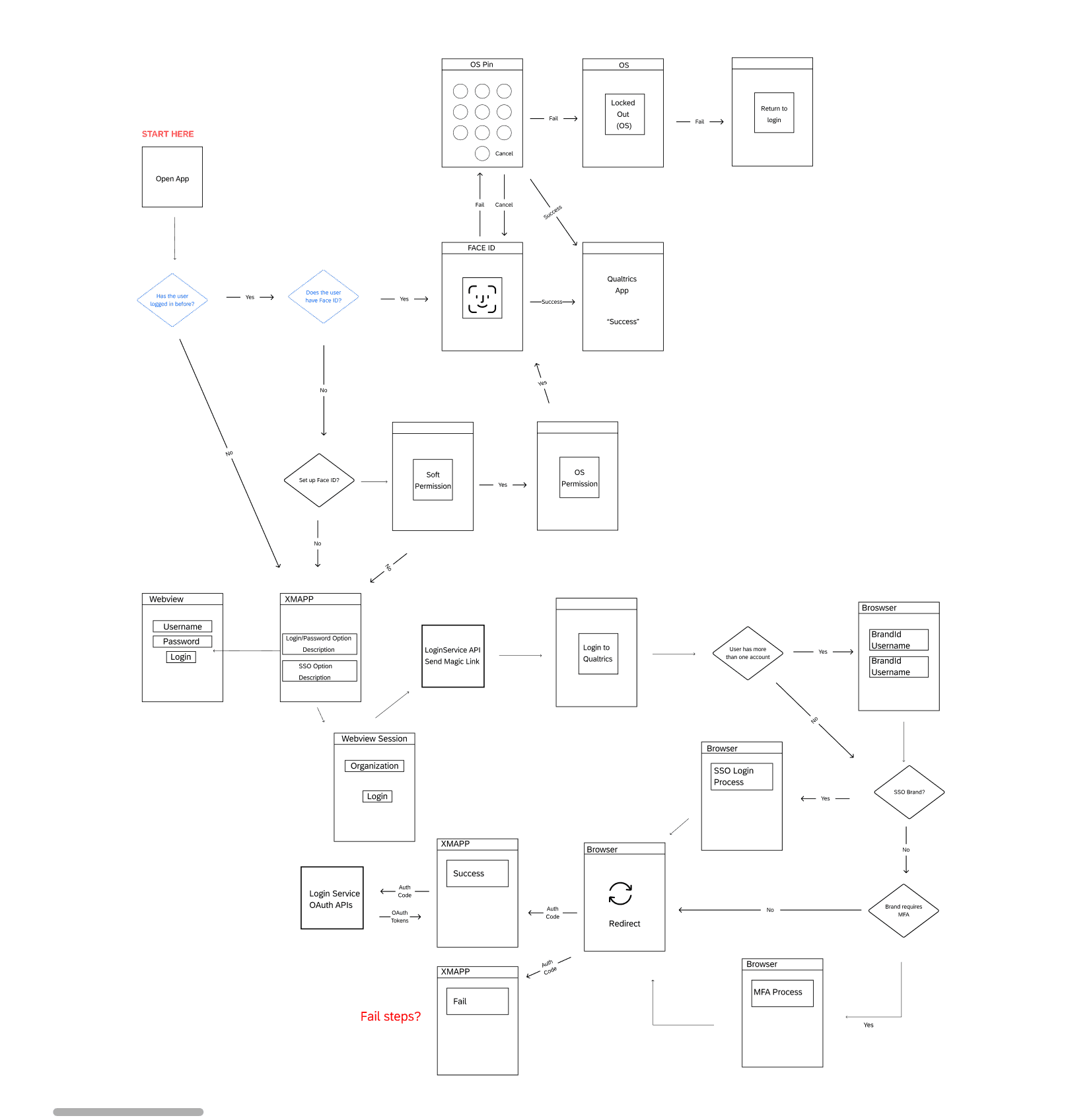
One of my most impactful projects focused on modernizing core workflows in the survey builder and dashboard tools—two heavily used but aging areas of the product. With user needs evolving and new feature demands growing, we needed to rework not just the UI, but also the underlying interaction patterns to support scale, simplicity, and consistency across devices.
Being able to contribute to both the vision and the hands-on implementation of these updates gave me a strong appreciation for designing at scale while staying grounded in real user needs.
🧩 The Challenge: Designing for Scale Without Adding Complexity
As Qualtrics quickly evolved into a multi-solution platform, one thing became clear: the user experience wasn’t keeping up with the product’s growth. While new features were built with updated patterns, large portions—especially dashboards and survey tools—were still running on legacy UI components.
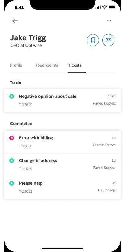
This created a fragmented experience, especially for newer or non-technical users. The interface looked and felt different depending on where you were in the product. And as more users started accessing dashboards from their phones—particularly executives needing quick insights—we knew the platform had to work better across screen sizes and workflows.
The core challenge: **Unify the experience, modernize key tools, and reduce friction—**all without overwhelming power users or disrupting their workflows.
🔍 Research & Discovery
To get a full picture of what was working (and what wasn’t), I partnered with product, research, and customer success to dig into pain points across user types and industries.
Research Methods:
Stakeholder Interviews: Worked with internal teams across verticals to identify friction points and feature blind spots
Support Ticket Analysis: Reviewed Zendesk logs and call summaries to uncover repeat usability issues
Competitive Research: Analyzed design systems and product flows from platforms like Medallia, SurveyMonkey, and Typeform to identify modern UX trends
Key Insights:
Users felt lost in deep workflows, especially during survey setup or dashboard editing
Legacy components looked outdated and created inconsistent mental models
Mobile usage was rising fast, but core tools weren’t optimized for smaller screens
Users wanted more contextual guidance—not more screens
“I never know where I am in the process—or what I might break if I click something wrong.”
— User Feedback, Customer Success Logs
🎯 Design Goals
From our research and internal alignment sessions, we focused on three key goals:
Simplify complex workflows without stripping away advanced functionality
Unify the UI under the modern Qualtrics design system for consistency and trust
Prioritize mobile, especially for executive users who needed dashboards on the go
💡 Ideation & UX Strategy
This wasn’t just about polishing UI—it was about making the product feel smarter, lighter, and more intuitive, especially during high-friction moments like creating surveys or building dashboards.
Concepts Explored:
Modular Layouts: Let users collapse, drag, and rearrange sections based on what mattered most
Inline Editing: Enabled quick updates to widgets and survey blocks without opening new screens
Consolidated Tool Panels: Grouped related actions into collapsible sidebars to reduce visual noise
Progressive Disclosure: Surface advanced options only when needed to avoid overwhelming users
Smarter Defaults & Templates: Help users get started quickly with pre-filled layouts and settings
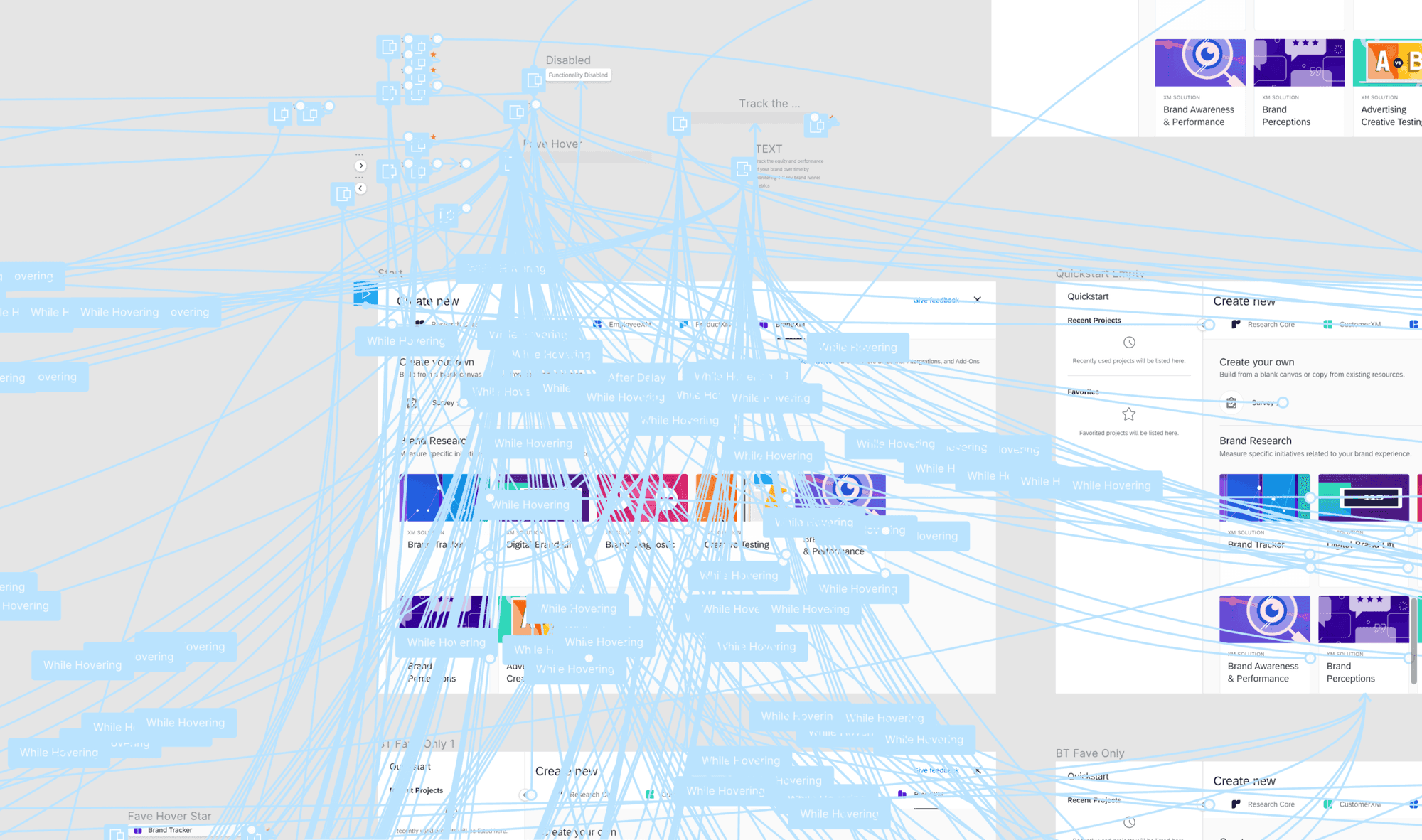
✏️ Design Execution
Using Figma, I created a suite of mid- and high-fidelity prototypes covering key user flows—survey creation, dashboard editing, and mobile dashboard interactions.
Key UX Improvements:
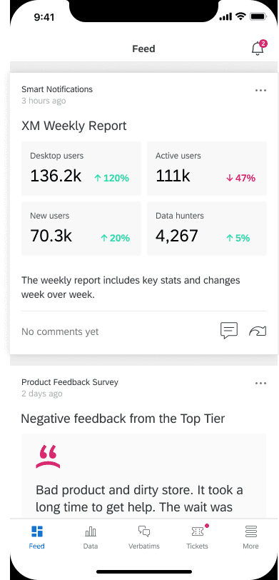
🧩 Dashboard Redesign:
Drag-and-drop module editing
Unified toolbar with edit/view toggles
Mobile-optimized layout with stacked, card-style widgets
📝 Smarter Survey Builder:
Streamlined flow with contextual tips and autosave
Real-time previews to help users see how changes will display
Reduced steps by offering intelligent defaults and template starting points
🧰 Design System Integration:
Migrated legacy patterns to the Qualtrics design system
Standardized components (buttons, inputs, tooltips, spacing)
Improved consistency across modules and views
🧪 Testing & Validation
We tested the updated designs with a mix of internal stakeholders and external users from key verticals.
Testing Approach:
Participants: Internal product teams + pilot customers from enterprise and education
Methods: Moderated testing on dashboard creation, survey building, and mobile usage
Focus Areas: Ease of use, task efficiency, visual clarity, responsiveness
Key Learnings:
Collapsed tool panels + inline editing made workflows faster and less overwhelming
Even advanced users appreciated tooltips and micro-copy—they reduced second-guessing
Mobile dashboard usage spiked—especially among executive users checking key metrics
Early exposure to too many advanced features caused decision fatigue—progressive disclosure was key
“This new experience just feels more confident. It gets out of my way, but it’s still powerful.”
— Pilot User, Post-Test Debrief
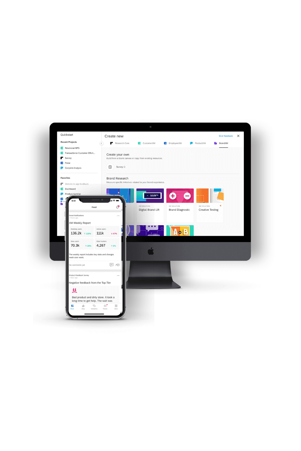
✅ Final Design Solution
Core Enhancements:
Modular Dashboards: Editable and customizable in one screen, with easy drag-and-drop and filter options
Smarter Survey Builder: Clean layout, fewer clicks, and contextual prompts to guide users along the way
Mobile Optimization: Adaptive layouts that preserved clarity and actionability on tablets and smartphones
Design System Migration: Unified look and feel across the platform, improving trust and navigability
Accessibility Improvements: Refined iconography, improved contrast, and better type for screen readers and keyboard users
📊 Results & Impact
📉 Reduced Support Volume:
Significant drop in tickets related to dashboard editing and survey building
Support teams reported faster onboarding for new users thanks to clearer UI flows
📈 Increased Engagement:
Power users customized dashboards more often and discovered new features
Executives accessed dashboards on mobile 2x more frequently in the months following launch
🚀 Improved Onboarding:
New users completed surveys and created dashboards with less guidance
Higher satisfaction in post-onboarding feedback surveys
💭 Reflections & Learnings
This project reinforced how important design consistency is when building at scale. Users want flexibility, but they also want to feel anchored. Legacy UI patterns had become friction points, not features.
Designing for complex platforms isn’t about dumbing things down—it’s about surfacing the right tools at the right time. And sometimes, the best UX decisions are the quiet ones: fewer screens, smarter defaults, and patterns that just feel right.
Ultimately, our goal was simple: make Qualtrics feel as powerful as it is—without making users work for it.