Published Feb 28, 2022
Punchh
Punchh is the leading loyalty, offers, and engagement platform for restaurants.

Project Overview
At Punchh I was the Lead Mobile UX Designer my focus was on redesigning our mobile framework. Our design team was not very large so I owned the entire mobile piece of the product. I did user research studies, competitive analysis, wireframes, flow charts, prototypes and the UI design iterations to present for review.
📱 The Challenge: Rethinking Mobile in a Post-COVID World
Punchh builds white-labeled mobile loyalty apps for restaurants and retail brands. But as the world shifted during and after COVID, so did user behavior—dramatically. Mobile ordering surged, digital loyalty became a competitive necessity, and expectations around mobile UX got a serious upgrade.
Our existing app framework, while functional, was starting to feel outdated:
It didn’t follow modern mobile design patterns
It was hard to customize across our client base
And it couldn’t keep pace with how people now engage with brands on mobile
The challenge wasn’t just visual—it was architectural. We needed to rebuild our mobile framework in a way that was standardized enough to scale across clients, but flexible enough to feel unique for each brand. All while making it fast, intuitive, and genuinely pleasant to use.
🔎 Discovery & Research
To build something that worked for both the end user and our enterprise clients, I led research efforts across multiple audiences. Our goal was to deeply understand pain points, expectations, and business realities.
Research Methods:
User Studies: We mapped key mobile journeys and ran task-based testing to pinpoint friction in the existing app—especially around ordering and reward redemption.
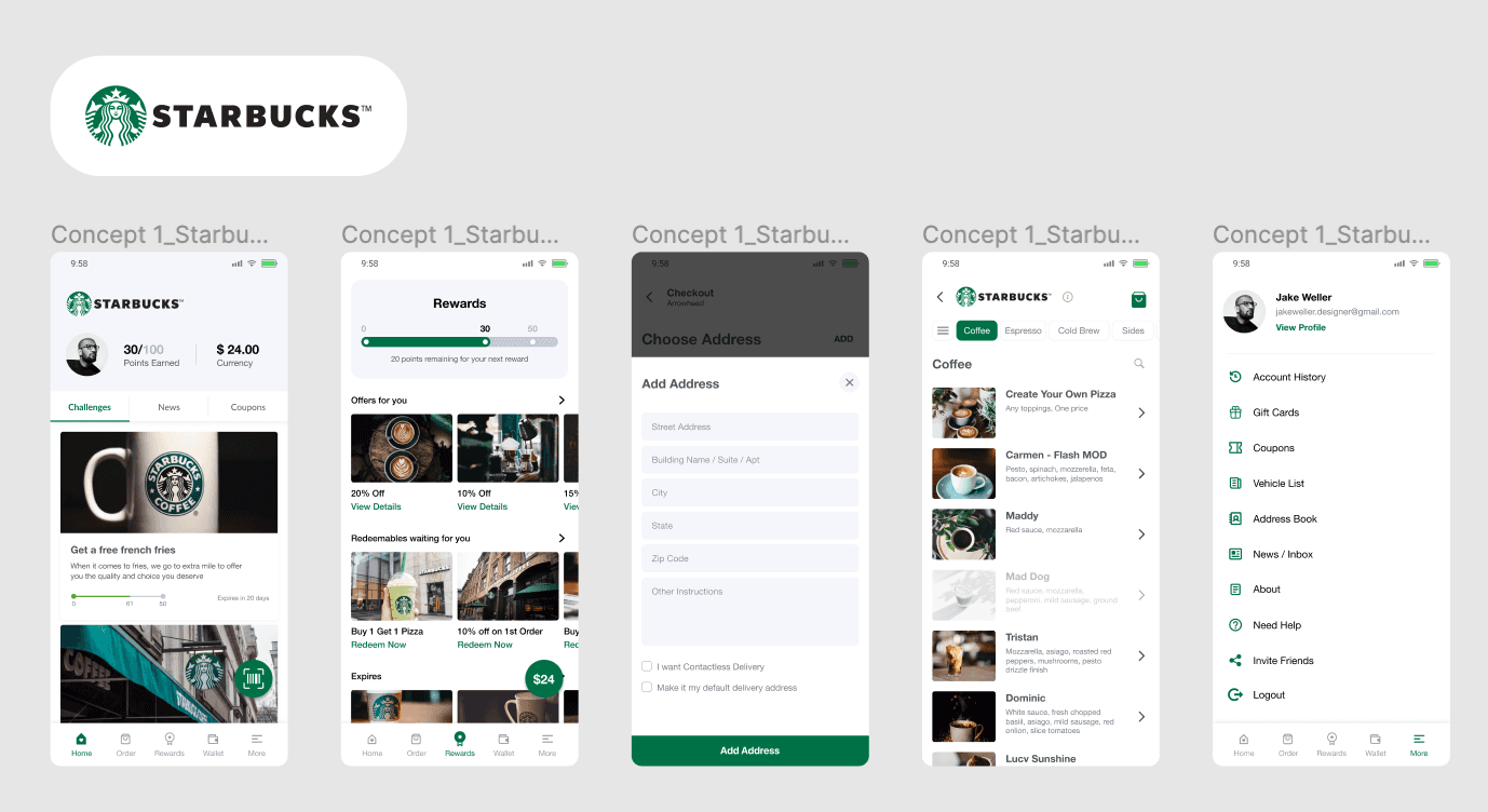
Competitive Analysis: I benchmarked apps from top players like Starbucks, Chick-fil-A, and McDonald’s to understand what “best in class” looked like.
Client Interviews: We spoke with clients across quick service (QSR) and casual dining to uncover the nuances of their operations and branding requirements.
Internal Feedback Loops: Collaborated with engineering, product, and customer success to ensure our redesign aligned with business and technical needs.
Key Insights:
Users wanted a clean, modern UI with fewer steps and faster access to key actions.
Competing apps offered more personalization, modularity, and touch-first design.
Clients needed greater branding control and configurability—menus, ordering flows, and loyalty programs often varied significantly.
“We want our app to feel like our brand—not just a generic template with our logo slapped on.”
— Client, National Fast Casual Brand
🎯 Design Goals
From the research, we aligned around three key goals:
Modernize the Look & Feel
Bring visual clarity and delight through updated UI patterns and mobile best practices.Increase Client Customizability
Build a flexible framework where modules, branding, and flows could be tailored per client—without reinventing the wheel every time.Boost User Engagement
Simplify reward redemption, make ordering feel intuitive, and reduce friction in everyday tasks.
✏️ Design Approach
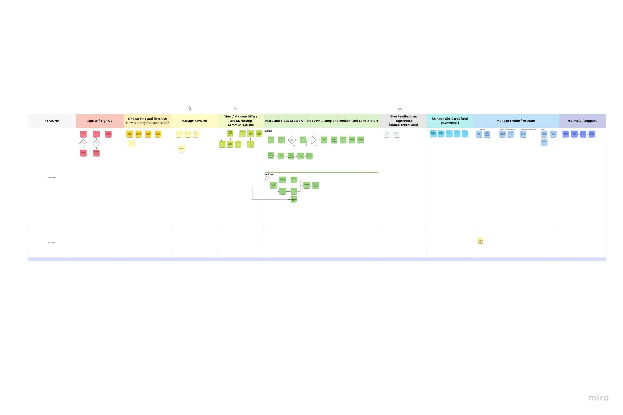
🧱 Modular UI System
To meet the dual needs of flexibility and scale, I proposed a component-based architecture—essentially a modular building block system where each part of the app (navigation, promotions, rewards, etc.) could be turned on/off, styled, or rearranged.
Key Modules Built:
Navigation System: Bottom nav with dynamic icons/labels to reflect client content priorities
Promo Banners & Home Layouts: Slot-based content modules with flexible CTA types
Loyalty Widgets: Tiers, punch cards, and point-based rewards—customizable per loyalty model
Custom Skins: Color palette, icon sets, and font overrides allowed each brand to fully represent itself
This setup made it possible to maintain a strong UX foundation while still giving each client’s app its own voice.
🗺 Streamlined Navigation & Information Architecture
The old app buried key flows under deep menus. We flattened the IA and reorganized core journeys around what users needed most:
Primary Flow: Home → Order → Pay/Reward → Confirmation
Simplified account-level settings into clearer categories (e.g., payment, past orders, profile)
Designed scalable flows that worked for both single-location and multi-location brands
🎨 Visual Design System
We developed a new mobile-first visual language that focused on clarity and lightness—eliminating noise and making actions feel fast and purposeful.
Design Principles Applied:
Larger tap targets, consistent iconography, and readable type
Purposeful use of whitespace to create calm and focus
Strategic color use for system states (e.g., available rewards, success messages, error alerts)
Design system elements optimized for both iOS and Android standards
🧪 Prototyping & Testing
We built high-fidelity mobile prototypes using Figma and conducted multiple rounds of validation—across internal teams, clients, and users.
Testing Highlights:
Internal Reviews: Partnered with PMs and engineers to validate how components could be swapped and reconfigured across client instances
Client Demos: Shared interactive prototypes with enterprise clients to gather early feedback on customization features
End-User Tests: Ran moderated Zoom-based tests on mobile to validate real-world flows like login, ordering, and reward redemption
“I love how fast this feels. Everything I need is right there on the home screen.”
— Mobile App User, Post-Test Interview
✅ Final Design Solution
Key Features Shipped:
Customizable Modules: Promo cards, rewards, ordering, banners—each was configurable per client, with styling hooks built in
Simplified Navigation: A persistent bottom nav enabled quick access to core flows
Rewards Experience Overhaul: Made it easy to track, earn, and redeem loyalty points—without hidden steps or confusion
Responsive Layouts: Designed to handle different device sizes and mobile OS quirks
Full Brand Control: Each app could fully reflect the client’s brand—with custom type, color, and iconography baked into the UI
🎨 Visual Enhancements:
Clean, minimalist aesthetic focused on usability
Modular grid and type system built to support text-heavy and image-heavy layouts
Flexible components that adapted to different reward types, ordering flows, and promotional formats
📊 Results & Impact
💬 User Feedback:
Users called out the clearer navigation and faster access to rewards as major improvements
Reward redemption completion rates improved by 30% during testing compared to the legacy app
📈 Client Outcomes:
Faster onboarding and configuration meant quicker time-to-launch
More control over branding and layout led to higher client satisfaction
Improved visual polish and UX led to higher demo conversion rates during sales pitches
🏆 Business Value:
Positioned Punchh as a modern leader in digital loyalty UX
Reduced engineering lift for new clients by leveraging modular components
Improved retention by delivering a mobile app framework that truly scaled across brand needs
💭 Reflections & Learnings
This project taught me that designing for white-label platforms means thinking beyond one ideal flow. Every decision had to balance standardization with personalization—and that challenge made the work incredibly rewarding.
Modularity isn’t just a dev concern—it’s a UX strategy. Building for flexibility means designing systems that respect variation without compromising usability. It also means understanding that "clean and consistent" doesn’t have to mean "generic."
With the right foundation, you can create something that works beautifully for many—while still feeling personal for each.